(function(){function run(){var list=document.querySelector(‚.lg-list‘);if(!list){setTimeout(run,120);return;}var ex=list.getElementsByTagName(‚a‘);for(var j=0;j<ex.length;j++){if(ex[j].getAttribute('href')==='/unser-team/')return;}var items=list.querySelectorAll('.lg-item');var bestOf=null;for(var i=0;i<items.length;i++){if(items[i].textContent.indexOf('Best of')!==-1){bestOf=items[i];break;}}var li=document.createElement('li');li.className='lg-item';var a=document.createElement('a');a.className='lg-row';a.href='/unser-team/';a.textContent='Unser Team';li.appendChild(a);if(bestOf)list.insertBefore(li,bestOf);else list.appendChild(li);}if(document.readyState==='loading')document.addEventListener('DOMContentLoaded',function(){setTimeout(run,150)});else setTimeout(run,150);})();
/* ============================================================
LUNA GOODS — Affiliate Homepage
Aesthetic: Cool editorial · Mist + Deep Navy + Sky
============================================================ */
:root {
–bg: #BFD3E6;
–bg-2: #9DB8D1;
–bg-card: #EDF3F9;
–ink: #0B1A2D;
–ink-soft: #233A57;
–ink-muted: #5A7A99;
–rule: #8FA9C3;
–accent: #1E4FAE;
–accent-2: #0F2B4A;
–accent-3: #E6B547;
–sand: #A8C0D8;
–font-display: ‚Fraunces‘, Georgia, serif;
–font-sans: ‚DM Sans‘, system-ui, sans-serif;
–font-mono: ‚JetBrains Mono‘, ui-monospace, monospace;
–radius: 12px;
–radius-lg: 20px;
–shadow-sm: 0 1px 2px rgba(30,26,20,.06);
–shadow-md: 0 8px 24px -10px rgba(30,26,20,.18);
}
/* — Variant 2: Cool Minimal — */
[data-variant=“minimal“] {
–bg: #F2F6FA;
–bg-2: #F2F6FA;
–bg-card: #FFFFFF;
–ink: #0A1220;
–ink-soft: #283449;
–ink-muted: #7388A0;
–rule: #DDE7F1;
–accent: #1E4AA6;
–accent-2: #141C2A;
–accent-3: #6EA9D4;
–sand: #E8EFF6;
–radius: 2px;
–radius-lg: 4px;
}
/* — Variant 3: Deep Ocean Maximalist — */
[data-variant=“cozy“] {
–bg: #BFD3E6;
–bg-2: #9DB8D1;
–bg-card: #EDF3F9;
–ink: #0B1A2D;
–ink-soft: #233A57;
–ink-muted: #5A7A99;
–rule: #8FA9C3;
–accent: #1E4FAE;
–accent-2: #0F2B4A;
–accent-3: #E6B547;
–sand: #A8C0D8;
–radius: 12px;
–radius-lg: 20px;
}
* { box-sizing: border-box; margin: 0; padding: 0; }
html, body {
background: var(–bg);
color: var(–ink);
font-family: var(–font-sans);
font-size: 16px;
line-height: 1.55;
-webkit-font-smoothing: antialiased;
overflow-x: hidden;
}
body::before {
content: „“;
position: fixed; inset: 0;
pointer-events: none;
background-image:
radial-gradient(rgba(30,26,20,.035) 1px, transparent 1px);
background-size: 3px 3px;
opacity: .7;
z-index: 1;
mix-blend-mode: multiply;
}
img { max-width: 100%; display: block; }
a { color: inherit; text-decoration: none; }
button { font-family: inherit; cursor: pointer; border: none; background: none; color: inherit; }
/* ============================================================
PLACEHOLDER SYSTEM — striped bg + mono label
============================================================ */
.ph {
position: relative;
background-color: var(–sand);
background-image: repeating-linear-gradient(
135deg,
transparent 0, transparent 14px,
rgba(30,26,20,.06) 14px, rgba(30,26,20,.06) 15px
);
border-radius: var(–radius);
display: flex; align-items: center; justify-content: center;
overflow: hidden;
color: var(–ink-soft);
}
.ph::after {
content: attr(data-label);
font-family: var(–font-mono);
font-size: 10px;
letter-spacing: 0.08em;
text-transform: uppercase;
padding: 4px 8px;
background: var(–bg-card);
border: 1px solid var(–rule);
border-radius: 2px;
opacity: .85;
}
/* ============================================================
AFFILIATE DISCLOSURE BAR
============================================================ */
.disclosure {
background: var(–accent-2);
color: #E8E1CF;
font-size: 12px;
text-align: center;
padding: 8px 16px;
font-family: var(–font-mono);
letter-spacing: 0.04em;
position: relative;
z-index: 10;
}
.disclosure strong { color: var(–accent-3); font-weight: 500; }
/* ============================================================
NAV
============================================================ */
.nav {
position: sticky; top: 0;
background: var(–bg);
border-bottom: 1px solid var(–rule);
z-index: 20;
backdrop-filter: blur(8px);
background: color-mix(in oklab, var(–bg) 88%, transparent);
}
.nav-inner {
max-width: 1360px;
margin: 0 auto;
padding: 18px 40px;
display: grid;
grid-template-columns: auto 1fr auto;
gap: 48px;
align-items: center;
}
.logo {
display: flex; align-items: center; gap: 10px;
font-family: var(–font-display);
font-size: 22px;
font-weight: 600;
letter-spacing: -0.02em;
}
.logo-mark {
width: 56px; height: 56px;
display: grid; place-items: center;
}
.logo-mark svg { width: 100%; height: 100%; }
.nav-links {
display: flex; gap: 32px;
font-size: 14px;
font-weight: 500;
}
.nav-links a {
position: relative;
padding: 6px 0;
transition: color .2s;
}
.nav-links a:hover { color: var(–accent); }
.nav-search {
display: flex; align-items: center;
gap: 20px;
}
.search-box {
display: flex; align-items: center; gap: 8px;
background: var(–bg-card);
border: 1px solid var(–rule);
padding: 8px 14px;
border-radius: var(–radius-lg);
font-size: 13px;
color: var(–ink-muted);
min-width: 220px;
transition: border-color .2s;
}
.search-box:focus-within { border-color: var(–accent); }
.search-box input {
border: none; outline: none;
background: transparent;
font-family: inherit;
font-size: 13px;
color: var(–ink);
width: 100%;
}
/* ============================================================
HERO
============================================================ */
.hero {
max-width: 1360px;
margin: 0 auto;
padding: 40px 40px 80px;
position: relative;
}
.hero-meta {
display: flex; align-items: center; gap: 16px;
font-family: var(–font-mono);
font-size: 11px;
letter-spacing: 0.12em;
text-transform: uppercase;
color: var(–ink-muted);
margin-bottom: 24px;
}
.hero-meta .dot {
width: 4px; height: 4px; background: var(–accent); border-radius: 50%;
}
.hero-grid {
display: grid;
grid-template-columns: 1.2fr 1fr;
gap: 48px;
align-items: end;
}
.hero-headline {
font-family: var(–font-display);
font-size: clamp(56px, 7vw, 104px);
line-height: 0.95;
letter-spacing: -0.035em;
font-weight: 400;
color: var(–ink);
}
.hero-headline em {
font-style: italic;
font-weight: 300;
color: var(–accent);
}
.hero-headline .underline {
position: relative;
display: inline-block;
}
.hero-headline .underline::after {
content: „“;
position: absolute;
left: 0; right: 0; bottom: 6px;
height: 10px;
background: var(–accent-3);
opacity: .35;
z-index: -1;
}
.hero-side {
display: flex; flex-direction: column; gap: 24px;
padding-bottom: 12px;
}
.hero-lede {
font-size: 17px;
line-height: 1.55;
color: var(–ink-soft);
max-width: 44ch;
font-weight: 400;
}
.hero-cta-row {
display: flex; gap: 12px; align-items: center; flex-wrap: wrap;
}
.btn {
display: inline-flex; align-items: center; gap: 8px;
padding: 14px 22px;
border-radius: var(–radius-lg);
font-weight: 500;
font-size: 14px;
letter-spacing: 0.01em;
transition: transform .15s ease, background .2s, box-shadow .2s;
}
.btn-primary {
background: var(–ink);
color: var(–bg-card);
}
.btn-primary:hover {
background: var(–accent);
transform: translateY(-1px);
}
.btn-secondary {
background: transparent;
color: var(–ink);
border: 1px solid var(–ink);
}
.btn-secondary:hover {
background: var(–ink);
color: var(–bg-card);
}
.hero-visual {
margin-top: 56px;
display: grid;
grid-template-columns: 1.5fr 1fr 1fr;
grid-template-rows: 280px 180px;
gap: 12px;
}
.hero-img-1 { grid-row: 1 / 3; }
.hero-img-2 { grid-column: 2; grid-row: 1; }
.hero-img-3 { grid-column: 3; grid-row: 1; }
.hero-img-4 { grid-column: 2 / 4; grid-row: 2; }
.hero-stats {
margin-top: 56px;
display: grid;
grid-template-columns: repeat(4, 1fr);
border-top: 1px solid var(–rule);
border-bottom: 1px solid var(–rule);
padding: 28px 0;
}
.stat {
padding: 0 24px;
border-right: 1px solid var(–rule);
}
.stat:last-child { border-right: none; }
.stat-num {
font-family: var(–font-display);
font-size: 44px;
line-height: 1;
letter-spacing: -0.03em;
font-weight: 400;
color: var(–ink);
margin-bottom: 6px;
}
.stat-num em { font-style: italic; color: var(–accent); }
.stat-label {
font-family: var(–font-mono);
font-size: 11px;
letter-spacing: 0.1em;
text-transform: uppercase;
color: var(–ink-muted);
}
/* ============================================================
DEAL BANNER
============================================================ */
.deal {
max-width: 1360px;
margin: 0 auto 80px;
padding: 0 40px;
}
.deal-inner {
background: var(–accent-2);
color: #E8E1CF;
border-radius: var(–radius-lg);
padding: 32px 40px;
display: grid;
grid-template-columns: auto 1fr auto auto;
align-items: center;
gap: 32px;
position: relative;
overflow: hidden;
}
.deal-inner::before {
content: „DEAL · DEAL · DEAL · DEAL · DEAL · DEAL · DEAL · DEAL · „;
position: absolute;
top: -14px; left: 0; right: 0;
font-family: var(–font-display);
font-style: italic;
font-size: 160px;
line-height: 1;
color: rgba(232, 225, 207, .04);
white-space: nowrap;
pointer-events: none;
font-weight: 300;
}
.deal-tag {
font-family: var(–font-mono);
font-size: 11px;
letter-spacing: 0.15em;
text-transform: uppercase;
padding: 6px 12px;
border: 1px solid var(–accent-3);
color: var(–accent-3);
border-radius: 2px;
position: relative; z-index: 1;
}
.deal-text { position: relative; z-index: 1; }
.deal-text h2 {
font-family: var(–font-display);
font-size: 28px;
line-height: 1.15;
font-weight: 500;
letter-spacing: -0.015em;
margin-bottom: 4px;
}
.deal-text p {
font-size: 13px;
color: #C8BFA8;
}
.deal-price {
position: relative; z-index: 1;
text-align: right;
}
.deal-price .old {
font-size: 13px;
color: #A89E85;
text-decoration: line-through;
margin-bottom: 2px;
}
.deal-price .new {
font-family: var(–font-display);
font-size: 36px;
line-height: 1;
color: var(–accent-3);
font-weight: 500;
}
.deal-btn {
position: relative; z-index: 1;
background: var(–accent-3);
color: var(–accent-2);
padding: 14px 22px;
border-radius: var(–radius-lg);
font-weight: 600;
font-size: 14px;
display: inline-flex; gap: 8px; align-items: center;
transition: transform .15s;
}
.deal-btn:hover { transform: translateY(-1px); }
/* ============================================================
CATEGORY SECTION
============================================================ */
.category {
max-width: 1360px;
margin: 0 auto;
padding: 0 40px 100px;
position: relative;
}
.cat-header {
display: grid;
grid-template-columns: 1fr 1fr;
gap: 48px;
align-items: end;
margin-bottom: 48px;
padding-bottom: 28px;
border-bottom: 1px solid var(–rule);
}
.cat-eyebrow {
display: flex; align-items: center; gap: 14px;
font-family: var(–font-mono);
font-size: 11px;
letter-spacing: 0.15em;
text-transform: uppercase;
color: var(–ink-muted);
margin-bottom: 16px;
}
.cat-num {
font-family: var(–font-display);
font-style: italic;
font-size: 14px;
font-weight: 500;
color: var(–accent);
}
.cat-title {
font-family: var(–font-display);
font-size: clamp(44px, 5.5vw, 72px);
line-height: 0.98;
letter-spacing: -0.03em;
font-weight: 400;
}
.cat-title em { font-style: italic; color: var(–accent); font-weight: 300; }
.cat-intro {
display: flex; flex-direction: column; gap: 18px;
padding-bottom: 8px;
}
.cat-intro p {
font-size: 15px;
color: var(–ink-soft);
line-height: 1.6;
max-width: 50ch;
}
.cat-expert {
display: flex; gap: 12px; align-items: center;
padding-top: 14px;
border-top: 1px solid var(–rule);
}
.expert-avatar {
width: 40px; height: 40px;
border-radius: 50%;
background: var(–sand);
background-image: repeating-linear-gradient(135deg, transparent 0 6px, rgba(30,26,20,.06) 6px 7px);
flex-shrink: 0;
}
.expert-meta {
font-size: 12px;
color: var(–ink-muted);
}
.expert-meta strong { color: var(–ink); display: block; font-weight: 600; }
.cat-filters {
display: flex; gap: 8px; flex-wrap: wrap;
margin-bottom: 32px;
}
.chip {
padding: 7px 14px;
background: var(–bg-card);
border: 1px solid var(–rule);
border-radius: 99px;
font-size: 12px;
font-weight: 500;
color: var(–ink-soft);
transition: all .2s;
cursor: pointer;
font-family: var(–font-sans);
}
.chip:hover, .chip.active {
background: var(–ink);
color: var(–bg-card);
border-color: var(–ink);
}
/* ============================================================
PRODUCT GRID
============================================================ */
.products {
display: grid;
grid-template-columns: repeat(3, 1fr);
gap: 24px;
}
.product {
background: var(–bg-card);
border: 1px solid var(–rule);
border-radius: var(–radius-lg);
overflow: hidden;
display: flex; flex-direction: column;
transition: transform .2s ease, box-shadow .25s ease;
position: relative;
}
.product:hover {
transform: translateY(-3px);
box-shadow: var(–shadow-md);
}
.product-img {
aspect-ratio: 4/3;
margin: 0;
border-radius: 0;
border-bottom: 1px solid var(–rule);
}
.product-badge {
position: absolute;
top: 14px; left: 14px;
background: var(–bg-card);
border: 1px solid var(–ink);
font-family: var(–font-mono);
font-size: 10px;
letter-spacing: 0.1em;
text-transform: uppercase;
padding: 4px 8px;
border-radius: 2px;
z-index: 2;
font-weight: 500;
}
.product-badge.tested {
background: var(–accent-2);
color: var(–accent-3);
border-color: var(–accent-2);
}
.product-badge.top {
background: var(–accent);
color: #fff;
border-color: var(–accent);
}
.product-body {
padding: 20px 22px 22px;
display: flex; flex-direction: column;
gap: 10px;
flex: 1;
}
.product-cat {
font-family: var(–font-mono);
font-size: 10px;
letter-spacing: 0.12em;
text-transform: uppercase;
color: var(–ink-muted);
}
.product-title {
font-family: var(–font-display);
font-size: 22px;
line-height: 1.15;
font-weight: 500;
letter-spacing: -0.01em;
}
.product-review {
font-size: 13.5px;
color: var(–ink-soft);
line-height: 1.5;
flex: 1;
}
.product-rating {
display: flex; align-items: center; gap: 10px;
padding-top: 4px;
}
.stars {
display: flex; gap: 2px;
color: var(–accent-3);
font-size: 14px;
letter-spacing: 1px;
}
.rating-num {
font-family: var(–font-mono);
font-size: 12px;
color: var(–ink-muted);
}
.product-footer {
display: grid;
grid-template-columns: auto 1fr;
gap: 12px;
align-items: center;
padding-top: 14px;
border-top: 1px solid var(–rule);
margin-top: 8px;
}
.product-price {
font-family: var(–font-display);
font-size: 22px;
font-weight: 500;
letter-spacing: -0.01em;
}
.product-price .from {
font-family: var(–font-mono);
font-size: 10px;
letter-spacing: 0.1em;
text-transform: uppercase;
color: var(–ink-muted);
display: block;
font-weight: 400;
margin-bottom: -2px;
}
.check-price {
background: var(–ink);
color: var(–bg-card);
padding: 11px 16px;
border-radius: var(–radius);
font-size: 13px;
font-weight: 500;
display: inline-flex; align-items: center; gap: 6px;
justify-content: center;
transition: background .2s;
}
.check-price:hover { background: var(–accent); }
.check-price svg { transition: transform .2s; }
.check-price:hover svg { transform: translate(2px, -2px); }
.cat-footer {
margin-top: 32px;
display: flex; justify-content: space-between; align-items: center;
padding: 20px 0;
border-top: 1px solid var(–rule);
font-size: 13px;
color: var(–ink-muted);
}
.cat-footer a {
color: var(–accent);
font-weight: 500;
display: inline-flex; align-items: center; gap: 6px;
}
/* ============================================================
COMPARISON TABLE (inside category 2)
============================================================ */
.compare {
margin-top: 48px;
background: var(–bg-card);
border: 1px solid var(–rule);
border-radius: var(–radius-lg);
overflow: hidden;
}
.compare-head {
padding: 24px 28px;
border-bottom: 1px solid var(–rule);
display: flex; justify-content: space-between; align-items: center;
background: var(–bg-2);
}
.compare-head h4 {
font-family: var(–font-display);
font-size: 22px;
font-weight: 500;
letter-spacing: -0.01em;
}
.compare-head .pill {
font-family: var(–font-mono);
font-size: 10px;
letter-spacing: 0.12em;
text-transform: uppercase;
padding: 5px 10px;
background: var(–accent);
color: #fff;
border-radius: 2px;
}
.compare table {
width: 100%;
border-collapse: collapse;
font-size: 14px;
}
.compare th, .compare td {
padding: 16px 20px;
text-align: left;
border-bottom: 1px solid var(–rule);
vertical-align: middle;
}
.compare th {
font-family: var(–font-mono);
font-size: 10px;
letter-spacing: 0.12em;
text-transform: uppercase;
color: var(–ink-muted);
font-weight: 500;
background: var(–bg-2);
}
.compare tr:last-child td { border-bottom: none; }
.compare td.prod {
font-family: var(–font-display);
font-size: 16px;
font-weight: 500;
}
.compare td.price {
font-family: var(–font-mono);
font-weight: 500;
color: var(–accent);
}
.compare .mini-stars { color: var(–accent-3); letter-spacing: 1px; font-size: 13px; }
.compare tbody tr:hover { background: var(–bg-2); }
.compare .go {
padding: 8px 14px;
background: var(–ink);
color: var(–bg-card);
border-radius: var(–radius);
font-size: 12px;
font-weight: 500;
display: inline-flex; align-items: center; gap: 6px;
}
/* ============================================================
PULL QUOTE / EXPERT QUOTE
============================================================ */
.pullquote {
max-width: 1360px;
margin: 0 auto 100px;
padding: 0 40px;
}
.pullquote-inner {
background: var(–bg-card);
border-left: 3px solid var(–accent);
padding: 48px 56px;
display: grid;
grid-template-columns: auto 1fr;
gap: 40px;
align-items: center;
border-radius: 0 var(–radius-lg) var(–radius-lg) 0;
}
.quote-mark {
font-family: var(–font-display);
font-style: italic;
font-size: 120px;
line-height: 0.7;
color: var(–accent);
font-weight: 300;
}
.quote-text {
font-family: var(–font-display);
font-size: 28px;
line-height: 1.25;
letter-spacing: -0.01em;
font-weight: 400;
color: var(–ink);
font-style: italic;
}
.quote-author {
margin-top: 20px;
display: flex; align-items: center; gap: 14px;
font-size: 13px;
color: var(–ink-muted);
font-style: normal;
}
.quote-author strong { color: var(–ink); font-weight: 600; }
/* ============================================================
GUIDES / BLOG
============================================================ */
.guides {
max-width: 1360px;
margin: 0 auto;
padding: 0 40px 100px;
}
.section-head {
display: grid;
grid-template-columns: 1fr auto;
align-items: end;
margin-bottom: 40px;
padding-bottom: 24px;
border-bottom: 1px solid var(–rule);
}
.section-head h2 {
font-family: var(–font-display);
font-size: clamp(40px, 4.5vw, 56px);
line-height: 1;
letter-spacing: -0.03em;
font-weight: 400;
}
.section-head h2 em { font-style: italic; color: var(–accent); font-weight: 300; }
.section-head .see-all {
font-family: var(–font-mono);
font-size: 11px;
letter-spacing: 0.12em;
text-transform: uppercase;
color: var(–ink-muted);
display: inline-flex; gap: 6px; align-items: center;
}
.guides-grid {
display: grid;
grid-template-columns: 2fr 1fr 1fr;
gap: 24px;
}
.guide {
display: flex; flex-direction: column;
gap: 16px;
transition: opacity .2s;
}
.guide:hover { opacity: .85; }
.guide:hover .guide-title { color: var(–accent); }
.guide-img {
aspect-ratio: 4/3;
border-radius: var(–radius-lg);
}
.guide.hero-guide .guide-img { aspect-ratio: 4/3.2; }
.guide-meta {
display: flex; gap: 10px; align-items: center;
font-family: var(–font-mono);
font-size: 11px;
letter-spacing: 0.08em;
text-transform: uppercase;
color: var(–ink-muted);
}
.guide-meta .tag {
padding: 3px 8px;
background: var(–sand);
color: var(–ink);
border-radius: 2px;
}
.guide-title {
font-family: var(–font-display);
font-size: 24px;
line-height: 1.15;
letter-spacing: -0.015em;
font-weight: 500;
transition: color .2s;
}
.guide.hero-guide .guide-title { font-size: 36px; }
.guide-desc {
font-size: 14px;
color: var(–ink-soft);
line-height: 1.55;
}
/* ============================================================
FAQ
============================================================ */
.faq {
max-width: 1360px;
margin: 0 auto;
padding: 0 40px 100px;
display: grid;
grid-template-columns: 1fr 1.5fr;
gap: 64px;
align-items: start;
}
.faq-side h2 {
font-family: var(–font-display);
font-size: clamp(40px, 4.5vw, 56px);
line-height: 1;
letter-spacing: -0.03em;
font-weight: 400;
margin-bottom: 20px;
}
.faq-side h2 em { font-style: italic; color: var(–accent); font-weight: 300; }
.faq-side p {
font-size: 15px;
color: var(–ink-soft);
line-height: 1.6;
margin-bottom: 24px;
max-width: 36ch;
}
.faq-list {
border-top: 1px solid var(–rule);
}
.faq-item {
border-bottom: 1px solid var(–rule);
}
.faq-q {
width: 100%;
padding: 22px 0;
display: grid;
grid-template-columns: 1fr auto;
align-items: center;
gap: 24px;
text-align: left;
font-family: var(–font-display);
font-size: 20px;
font-weight: 500;
letter-spacing: -0.01em;
color: var(–ink);
transition: color .2s;
}
.faq-q:hover { color: var(–accent); }
.faq-icon {
width: 28px; height: 28px;
border: 1px solid var(–rule);
border-radius: 50%;
display: grid; place-items: center;
transition: all .25s;
flex-shrink: 0;
}
.faq-icon::before {
content: „+“;
font-family: var(–font-sans);
font-weight: 400;
font-size: 18px;
color: var(–ink-soft);
transition: transform .25s;
}
.faq-item.open .faq-icon {
background: var(–ink);
border-color: var(–ink);
}
.faq-item.open .faq-icon::before {
transform: rotate(45deg);
color: var(–bg-card);
}
.faq-a {
max-height: 0;
overflow: hidden;
transition: max-height .35s ease;
color: var(–ink-soft);
font-size: 15px;
line-height: 1.6;
}
.faq-item.open .faq-a {
max-height: 260px;
padding-bottom: 22px;
}
/* ============================================================
NEWSLETTER / FOOTER
============================================================ */
.newsletter {
background: var(–accent-2);
color: #E8E1CF;
padding: 80px 40px;
position: relative;
overflow: hidden;
}
.newsletter-inner {
max-width: 1360px;
margin: 0 auto;
display: grid;
grid-template-columns: 1fr 1fr;
gap: 64px;
align-items: center;
position: relative;
z-index: 1;
}
.newsletter h2 {
font-family: var(–font-display);
font-size: clamp(40px, 4.5vw, 64px);
line-height: 1;
letter-spacing: -0.03em;
font-weight: 400;
}
.newsletter h2 em { font-style: italic; color: var(–accent-3); font-weight: 300; }
.newsletter p {
font-size: 15px;
color: #C8BFA8;
margin-top: 16px;
max-width: 42ch;
}
.newsletter-form {
display: grid;
gap: 12px;
}
.nl-row {
display: grid;
grid-template-columns: 1fr auto;
gap: 8px;
background: rgba(232, 225, 207, .08);
border: 1px solid rgba(232, 225, 207, .15);
border-radius: var(–radius-lg);
padding: 4px;
}
.nl-row input {
background: transparent;
border: none; outline: none;
padding: 14px 16px;
color: #E8E1CF;
font-family: inherit;
font-size: 15px;
}
.nl-row input::placeholder { color: #8A8166; }
.nl-btn {
background: var(–accent-3);
color: var(–accent-2);
padding: 12px 22px;
border-radius: calc(var(–radius-lg) – 2px);
font-weight: 600;
font-size: 14px;
transition: background .2s;
}
.nl-btn:hover { background: #F0B64D; }
.nl-note {
font-family: var(–font-mono);
font-size: 11px;
letter-spacing: 0.08em;
color: #8A8166;
display: flex; gap: 10px; align-items: center;
}
footer {
background: var(–ink);
color: #B8AE95;
padding: 64px 40px 32px;
font-size: 13px;
}
.foot-inner {
max-width: 1360px;
margin: 0 auto;
display: grid;
grid-template-columns: 2fr 1fr 1fr 1fr;
gap: 48px;
padding-bottom: 48px;
border-bottom: 1px solid rgba(184, 174, 149, .15);
}
.foot-brand .logo { color: var(–bg-card); margin-bottom: 14px; }
.foot-brand p { max-width: 36ch; line-height: 1.6; }
.foot-col .foot-col-title {
font-family: var(–font-mono);
font-size: 11px;
letter-spacing: 0.12em;
text-transform: uppercase;
color: var(–bg-card);
margin-bottom: 18px;
font-weight: 500;
}
.foot-col ul { list-style: none; display: flex; flex-direction: column; gap: 10px; }
.foot-col a:hover { color: var(–accent-3); }
.foot-bottom {
max-width: 1360px;
margin: 32px auto 0;
display: flex; justify-content: space-between;
font-family: var(–font-mono);
font-size: 11px;
letter-spacing: 0.08em;
color: #6F6650;
}
/* ============================================================
TWEAKS PANEL
============================================================ */
.tweaks-panel {
position: fixed;
bottom: 24px; right: 24px;
width: 300px;
background: var(–bg-card);
border: 1px solid var(–rule);
border-radius: var(–radius-lg);
box-shadow: 0 20px 50px -10px rgba(30,26,20,.25);
z-index: 100;
padding: 18px;
display: none;
font-family: var(–font-sans);
}
.tweaks-panel.open { display: block; }
.tweaks-panel h4 {
font-family: var(–font-display);
font-size: 16px;
font-weight: 600;
margin-bottom: 4px;
display: flex; justify-content: space-between; align-items: center;
}
.tweaks-panel .sub {
font-size: 11px;
color: var(–ink-muted);
font-family: var(–font-mono);
letter-spacing: 0.08em;
text-transform: uppercase;
margin-bottom: 14px;
}
.tweak-row {
display: grid;
gap: 6px;
margin-bottom: 14px;
}
.tweak-row label {
font-size: 11px;
font-family: var(–font-mono);
letter-spacing: 0.08em;
text-transform: uppercase;
color: var(–ink-muted);
}
.tweak-variants {
display: grid;
grid-template-columns: 1fr 1fr 1fr;
gap: 6px;
}
.tweak-variants button {
padding: 10px 8px;
border: 1px solid var(–rule);
border-radius: var(–radius);
font-size: 12px;
background: var(–bg);
font-weight: 500;
transition: all .2s;
}
.tweak-variants button.active {
background: var(–ink);
color: var(–bg-card);
border-color: var(–ink);
}
/* ============================================================
SCROLL REVEAL
============================================================ */
.reveal {
opacity: 0;
transform: translateY(20px);
transition: opacity .8s ease, transform .8s ease;
}
.reveal.in {
opacity: 1;
transform: translateY(0);
}
/* ============================================================
RESPONSIVE
============================================================ */
@media (max-width: 900px) {
.hero-grid, .cat-header, .faq, .newsletter-inner, .foot-inner, .pullquote-inner { grid-template-columns: 1fr; gap: 32px; }
.products, .guides-grid { grid-template-columns: 1fr; }
.hero-stats { grid-template-columns: repeat(2, 1fr); }
.stat { border-right: none; padding: 16px 0; border-bottom: 1px solid var(–rule); }
.nav-inner { grid-template-columns: 1fr; gap: 16px; padding: 16px 20px; }
.nav-links { display: none; }
.deal-inner { grid-template-columns: 1fr; text-align: left; }
.hero, .deal, .category, .pullquote, .guides, .faq { padding-left: 20px; padding-right: 20px; }
}
/* LUNA GOODS — Astra/Elementor override */
html, body,
body.elementor-default,
body.ast-theme-transparent-header,
.ast-plain-container, .ast-container,
.site, #page, #content, .site-content, .hfeed {
background: var(–bg) !important;
}
.luna-goods-design {
background: var(–bg);
}
.luna-goods-design .hero-link {
display: block;
text-decoration: none;
cursor: pointer;
position: relative;
transition: transform .25s ease, box-shadow .25s ease;
}
.luna-goods-design .hero-link:hover {
transform: translateY(-3px);
box-shadow: var(–shadow-md);
}
.luna-goods-design .hero-link::after {
/* data-label weiterhin sichtbar wie bei .ph */
}
/* LUNA GOODS — Reveal-Override + Kachel-Tuning */
.luna-goods-design .reveal { opacity: 1 !important; transform: none !important; }
.luna-goods-design .guide-img { aspect-ratio: 16/10; }
.luna-goods-design .hero-guide .guide-img { aspect-ratio: 16/10; }
.luna-goods-design .guide-title { font-size: 19px; line-height: 1.3; }
.luna-goods-design .hero-guide .guide-title { font-size: 28px; line-height: 1.2; }
.luna-goods-design .guide-desc { font-size: 13.5px; }
.luna-goods-design .guides-grid { gap: 20px; }
.luna-goods-design .guide { gap: 12px; }
/* LUNA GOODS — Review-Link in Produktkarten */
.luna-goods-design .product-rating { display: flex; align-items: center; gap: 10px; flex-wrap: wrap; }
.luna-goods-design .review-link {
margin-left: auto;
font-family: var(–font-mono);
font-size: 11px;
letter-spacing: .06em;
text-transform: uppercase;
color: var(–accent);
text-decoration: none;
border-bottom: 1px solid transparent;
transition: border-color .2s;
white-space: nowrap;
}
.luna-goods-design .review-link:hover { border-bottom-color: var(–accent); }
/* LUNA GOODS — Dropdown Nav */
.luna-goods-design .nav-links { position: relative; }
.luna-goods-design .nav-item { position: relative; display: inline-block; }
.luna-goods-design .nav-item > a { display: inline-block; }
.luna-goods-design .nav-dropdown {
position: absolute;
top: 100%;
left: -12px;
min-width: 240px;
background: var(–bg-card);
border: 1px solid var(–rule);
border-radius: var(–radius-lg);
padding: 10px;
opacity: 0;
visibility: hidden;
transform: translateY(6px);
transition: opacity .18s ease, transform .18s ease, visibility .18s;
box-shadow: var(–shadow-md);
z-index: 100;
margin-top: 10px;
}
.luna-goods-design .nav-item:hover .nav-dropdown,
.luna-goods-design .nav-dropdown:hover {
opacity: 1;
visibility: visible;
transform: translateY(0);
}
.luna-goods-design .nav-dropdown::before {
content: “;
position: absolute;
top: -10px; left: 0; right: 0; height: 10px;
}
.luna-goods-design .nav-dropdown a {
display: block;
padding: 9px 14px;
color: var(–ink-soft);
text-decoration: none;
font-size: 14px;
border-radius: var(–radius);
transition: background .15s, color .15s;
}
.luna-goods-design .nav-dropdown a:hover {
background: var(–bg);
color: var(–accent);
}
/* LUNA GOODS — Review-Link als Button + Layout-Fix */
.luna-goods-design .product-rating {
display: flex;
align-items: center;
gap: 10px;
flex-wrap: nowrap;
min-width: 0;
}
.luna-goods-design .product-rating .rating-num {
font-size: 12px;
white-space: nowrap;
overflow: hidden;
text-overflow: ellipsis;
min-width: 0;
flex: 1;
}
.luna-goods-design .review-link {
display: inline-flex;
align-items: center;
gap: 6px;
align-self: flex-start;
padding: 7px 12px;
border: 1.5px solid var(–accent);
border-radius: var(–radius);
background: transparent;
font-family: var(–font-mono);
font-size: 11px;
letter-spacing: .06em;
text-transform: uppercase;
color: var(–accent) !important;
text-decoration: none !important;
transition: background .18s ease, color .18s ease;
white-space: nowrap;
margin: 10px 0 4px;
font-weight: 500;
}
.luna-goods-design .review-link:hover {
background: var(–accent);
color: var(–bg-card) !important;
}
/* LUNA GOODS — Featured Product Block (Landing Page) */
.luna-goods-design .featured-product { padding: 3rem 4% 4rem; }
.luna-goods-design .featured-wrap {
max-width: 1200px;
margin: 0 auto;
background: var(–bg-card);
border-radius: var(–radius-lg);
overflow: hidden;
box-shadow: var(–shadow-md);
}
.luna-goods-design .featured-grid {
display: grid;
grid-template-columns: 1.1fr 1fr;
gap: 0;
}
.luna-goods-design .featured-image {
background: var(–bg-2);
display: flex;
align-items: center;
justify-content: center;
padding: 2rem;
}
.luna-goods-design .featured-image img {
width: 100%;
height: auto;
border-radius: var(–radius);
max-height: 520px;
object-fit: cover;
}
.luna-goods-design .featured-content {
padding: 2.5rem;
display: flex;
flex-direction: column;
gap: 1rem;
}
.luna-goods-design .featured-meta {
display: flex;
align-items: center;
gap: 10px;
font-family: var(–font-mono);
font-size: 11px;
letter-spacing: .08em;
text-transform: uppercase;
color: var(–accent);
}
.luna-goods-design .featured-badge {
background: var(–accent);
color: var(–bg-card);
padding: 4px 10px;
border-radius: var(–radius);
}
.luna-goods-design .featured-cat { color: var(–ink-muted); }
.luna-goods-design .featured-content h2 {
font-family: var(–font-display);
font-size: 40px;
line-height: 1.08;
color: var(–ink);
font-weight: 600;
margin: 0;
}
.luna-goods-design .featured-content h2 em { color: var(–accent); font-style: italic; }
.luna-goods-design .featured-lede {
font-size: 16px;
color: var(–ink-soft);
line-height: 1.6;
margin: 0;
}
.luna-goods-design .featured-rating {
display: flex;
align-items: center;
gap: 10px;
margin-top: .5rem;
padding-top: 1rem;
border-top: 1px solid var(–rule);
}
.luna-goods-design .featured-rating .stars { color: #E6B547; font-size: 16px; }
.luna-goods-design .featured-rating .rating-num {
font-family: var(–font-mono);
font-size: 13px;
color: var(–ink-muted);
}
.luna-goods-design .featured-features {
list-style: none;
padding: 0;
margin: .5rem 0;
display: grid;
grid-template-columns: 1fr 1fr;
gap: 8px 20px;
}
.luna-goods-design .featured-features li {
padding-left: 1.5rem;
position: relative;
color: var(–ink-soft);
font-size: 14px;
line-height: 1.45;
}
.luna-goods-design .featured-features li::before {
content: ‚\2713‘;
position: absolute;
left: 0;
color: var(–accent);
font-weight: bold;
}
.luna-goods-design .featured-pricing {
display: flex;
align-items: baseline;
gap: .5rem;
font-family: var(–font-display);
}
.luna-goods-design .featured-pricing .from {
font-size: 14px;
color: var(–ink-muted);
font-family: var(–font-sans);
}
.luna-goods-design .featured-pricing .price {
font-size: 34px;
color: var(–ink);
font-weight: 600;
}
.luna-goods-design .featured-cta {
display: flex;
gap: 12px;
margin-top: 1rem;
flex-wrap: wrap;
}
.luna-goods-design .featured-cta .btn {
padding: 12px 22px;
font-size: 14px;
font-family: var(–font-sans);
border-radius: var(–radius);
text-decoration: none;
display: inline-flex;
align-items: center;
gap: 8px;
transition: all .18s;
border: 1.5px solid transparent;
}
.luna-goods-design .featured-cta .btn-primary {
background: var(–accent-2);
color: var(–bg-card);
}
.luna-goods-design .featured-cta .btn-primary:hover {
background: var(–accent);
}
.luna-goods-design .featured-cta .btn-secondary {
background: transparent;
color: var(–accent);
border-color: var(–accent);
}
.luna-goods-design .featured-cta .btn-secondary:hover {
background: var(–accent);
color: var(–bg-card);
}
@media (max-width: 820px) {
.luna-goods-design .featured-grid { grid-template-columns: 1fr; }
.luna-goods-design .featured-content { padding: 1.5rem; }
.luna-goods-design .featured-content h2 { font-size: 32px; }
.luna-goods-design .featured-features { grid-template-columns: 1fr; }
}
.luna-goods-design .more-coming {
max-width: 720px;
margin: 4rem auto 0;
padding: 2.5rem 2rem;
text-align: center;
background: var(–bg-card);
border: 1px dashed var(–rule);
border-radius: var(–radius-lg);
}
.luna-goods-design .more-coming .eyebrow {
font-family: var(–font-mono);
font-size: 11px;
letter-spacing: .1em;
text-transform: uppercase;
color: var(–accent);
margin-bottom: .8rem;
}
.luna-goods-design .more-coming h3 {
font-family: var(–font-display);
font-size: 24px;
color: var(–ink);
margin-bottom: .8rem;
}
.luna-goods-design .more-coming p {
color: var(–ink-muted);
max-width: 460px;
margin: 0 auto;
line-height: 1.6;
font-size: 14px;
}
/* LUNA GOODS — Review Page Styles */
.luna-goods-design .review-page { max-width: 900px; margin: 0 auto; padding: 2rem 4%; }
.luna-goods-design .breadcrumb {
font-family: var(–font-mono);
font-size: 11px;
letter-spacing: .06em;
text-transform: uppercase;
color: var(–ink-muted);
margin-bottom: 1.5rem;
}
.luna-goods-design .breadcrumb a { color: var(–accent); text-decoration: none; }
.luna-goods-design .breadcrumb a:hover { text-decoration: underline; }
.luna-goods-design .rev-hero {
display: grid;
grid-template-columns: 1fr 1.1fr;
gap: 2.5rem;
background: var(–bg-card);
border-radius: var(–radius-lg);
overflow: hidden;
padding: 2rem;
margin-bottom: 2.5rem;
}
.luna-goods-design .rev-hero img { width: 100%; border-radius: var(–radius); object-fit: cover; max-height: 520px; }
.luna-goods-design .rev-hero-content { display: flex; flex-direction: column; gap: 1rem; justify-content: center; }
.luna-goods-design .rev-eyebrow {
font-family: var(–font-mono);
font-size: 11px;
letter-spacing: .08em;
text-transform: uppercase;
color: var(–accent);
}
.luna-goods-design .rev-title {
font-family: var(–font-display);
font-size: 42px;
line-height: 1.08;
color: var(–ink);
font-weight: 600;
margin: 0;
}
.luna-goods-design .rev-title em { color: var(–accent); font-style: italic; }
.luna-goods-design .rev-verdict {
display: flex;
align-items: center;
gap: 1.25rem;
padding: 1.25rem;
background: var(–bg);
border-left: 4px solid var(–accent);
border-radius: var(–radius);
}
.luna-goods-design .rev-score {
font-family: var(–font-display);
font-size: 48px;
color: var(–accent);
font-weight: 700;
line-height: 1;
}
.luna-goods-design .rev-score small { font-size: 18px; color: var(–ink-muted); font-weight: 400; }
.luna-goods-design .rev-verdict-text { flex: 1; }
.luna-goods-design .rev-verdict-text strong { display: block; font-family: var(–font-display); font-size: 18px; color: var(–ink); margin-bottom: 4px; }
.luna-goods-design .rev-verdict-text span { font-size: 13px; color: var(–ink-soft); }
.luna-goods-design .rev-cta {
display: flex;
gap: 10px;
flex-wrap: wrap;
}
.luna-goods-design .rev-cta .btn {
padding: 12px 22px;
font-size: 14px;
border-radius: var(–radius);
text-decoration: none;
display: inline-flex;
align-items: center;
gap: 8px;
transition: all .18s;
border: 1.5px solid transparent;
font-family: var(–font-sans);
}
.luna-goods-design .rev-cta .btn-primary { background: var(–accent-2); color: var(–bg-card); }
.luna-goods-design .rev-cta .btn-primary:hover { background: var(–accent); }
.luna-goods-design .rev-cta .btn-secondary { background: transparent; color: var(–accent); border-color: var(–accent); }
.luna-goods-design .rev-cta .btn-secondary:hover { background: var(–accent); color: var(–bg-card); }
.luna-goods-design .rev-tldr {
background: var(–bg-card);
border-radius: var(–radius-lg);
padding: 2rem;
margin: 2rem 0;
display: grid;
grid-template-columns: 1fr 1fr;
gap: 2rem;
}
.luna-goods-design .rev-tldr h3 {
font-family: var(–font-mono);
font-size: 11px;
letter-spacing: .08em;
text-transform: uppercase;
margin-bottom: .75rem;
}
.luna-goods-design .rev-tldr .pros h3 { color: #1c7a4a; }
.luna-goods-design .rev-tldr .cons h3 { color: #a63e3e; }
.luna-goods-design .rev-tldr ul { list-style: none; padding: 0; }
.luna-goods-design .rev-tldr li {
padding: 6px 0 6px 1.8rem;
position: relative;
font-size: 14.5px;
line-height: 1.5;
color: var(–ink-soft);
}
.luna-goods-design .rev-tldr .pros li::before { content: ‚\2713‘; position: absolute; left: 0; color: #1c7a4a; font-weight: bold; }
.luna-goods-design .rev-tldr .cons li::before { content: ‚\2716‘; position: absolute; left: 0; color: #a63e3e; font-weight: bold; }
.luna-goods-design .rev-section { margin: 3rem 0; }
.luna-goods-design .rev-section h2 {
font-family: var(–font-display);
font-size: 30px;
color: var(–ink);
margin-bottom: 1rem;
line-height: 1.2;
}
.luna-goods-design .rev-section h2 em { color: var(–accent); font-style: italic; }
.luna-goods-design .rev-section h3 {
font-family: var(–font-display);
font-size: 20px;
color: var(–ink);
margin: 1.5rem 0 .5rem;
}
.luna-goods-design .rev-section p, .luna-goods-design .rev-section li {
font-size: 16px;
line-height: 1.7;
color: var(–ink-soft);
margin-bottom: 1rem;
}
.luna-goods-design .rev-section ul { padding-left: 1.5rem; }
.luna-goods-design .rev-section li { margin-bottom: .5rem; }
.luna-goods-design .rev-callout {
padding: 1.25rem 1.5rem;
background: var(–bg);
border-left: 3px solid var(–accent);
border-radius: 0 var(–radius) var(–radius) 0;
margin: 1.5rem 0;
font-style: italic;
color: var(–ink);
}
.luna-goods-design .rev-specs {
width: 100%;
border-collapse: collapse;
margin: 1.5rem 0;
background: var(–bg-card);
border-radius: var(–radius);
overflow: hidden;
}
.luna-goods-design .rev-specs th, .luna-goods-design .rev-specs td {
padding: 12px 16px;
text-align: left;
border-bottom: 1px solid var(–rule);
font-size: 14.5px;
}
.luna-goods-design .rev-specs th { background: var(–bg-2); color: var(–ink); font-family: var(–font-mono); font-size: 12px; text-transform: uppercase; letter-spacing: .05em; }
.luna-goods-design .rev-specs tr:last-child td { border-bottom: none; }
.luna-goods-design .rev-for-whom {
display: grid;
grid-template-columns: 1fr 1fr;
gap: 1.5rem;
margin: 1.5rem 0;
}
.luna-goods-design .rev-for-whom > div {
padding: 1.5rem;
border-radius: var(–radius-lg);
background: var(–bg-card);
}
.luna-goods-design .rev-for-whom .yes h4 { color: #1c7a4a; }
.luna-goods-design .rev-for-whom .no h4 { color: #a63e3e; }
.luna-goods-design .rev-for-whom h4 {
font-family: var(–font-mono);
font-size: 12px;
letter-spacing: .08em;
text-transform: uppercase;
margin-bottom: .75rem;
}
.luna-goods-design .rev-for-whom li {
list-style: none;
padding: 4px 0 4px 1.5rem;
position: relative;
font-size: 14.5px;
color: var(–ink-soft);
line-height: 1.5;
margin: 0;
}
.luna-goods-design .rev-for-whom .yes li::before { content: ‚\2713‘; position: absolute; left: 0; color: #1c7a4a; font-weight: bold; }
.luna-goods-design .rev-for-whom .no li::before { content: ‚\2716‘; position: absolute; left: 0; color: #a63e3e; font-weight: bold; }
.luna-goods-design .rev-faq { margin: 2rem 0; }
.luna-goods-design .rev-faq details {
background: var(–bg-card);
border-radius: var(–radius);
padding: 1rem 1.25rem;
margin-bottom: 8px;
cursor: pointer;
}
.luna-goods-design .rev-faq summary {
font-family: var(–font-display);
font-size: 17px;
color: var(–ink);
font-weight: 500;
list-style: none;
display: flex;
justify-content: space-between;
align-items: center;
}
.luna-goods-design .rev-faq summary::after { content: ‚+‘; font-size: 20px; color: var(–accent); }
.luna-goods-design .rev-faq details[open] summary::after { content: ‚\2013‘; }
.luna-goods-design .rev-faq details p { padding-top: 10px; margin: 0; color: var(–ink-soft); font-size: 15px; line-height: 1.6; }
.luna-goods-design .rev-alternatives { margin: 3rem 0; }
.luna-goods-design .rev-alt-grid { display: grid; grid-template-columns: 1fr 1fr 1fr; gap: 1rem; }
.luna-goods-design .rev-alt {
padding: 1.25rem;
background: var(–bg-card);
border-radius: var(–radius-lg);
border: 1px solid var(–rule);
}
.luna-goods-design .rev-alt .tag {
font-family: var(–font-mono);
font-size: 10px;
letter-spacing: .08em;
text-transform: uppercase;
color: var(–accent);
display: block;
margin-bottom: 6px;
}
.luna-goods-design .rev-alt h4 {
font-family: var(–font-display);
font-size: 18px;
color: var(–ink);
margin-bottom: 6px;
}
.luna-goods-design .rev-alt p { font-size: 13.5px; color: var(–ink-muted); line-height: 1.5; margin-bottom: 0; }
.luna-goods-design .rev-final-cta {
text-align: center;
padding: 2.5rem 2rem;
background: var(–bg-card);
border-radius: var(–radius-lg);
margin: 3rem 0 2rem;
}
.luna-goods-design .rev-final-cta h3 { font-family: var(–font-display); font-size: 28px; color: var(–ink); margin-bottom: 1rem; }
.luna-goods-design .rev-final-cta p { color: var(–ink-muted); max-width: 520px; margin: 0 auto 1.5rem; }
.luna-goods-design .rev-disclaimer {
font-size: 12px;
color: var(–ink-muted);
font-style: italic;
padding: 1rem;
border-top: 1px solid var(–rule);
margin-top: 2rem;
}
@media (max-width: 820px) {
.luna-goods-design .rev-hero { grid-template-columns: 1fr; padding: 1rem; gap: 1.5rem; }
.luna-goods-design .rev-title { font-size: 32px; }
.luna-goods-design .rev-tldr { grid-template-columns: 1fr; }
.luna-goods-design .rev-for-whom { grid-template-columns: 1fr; }
.luna-goods-design .rev-alt-grid { grid-template-columns: 1fr; }
}
/* LUNA GOODS — Size Selector */
.luna-goods-design .size-selector {
background: var(–bg-card);
border-radius: var(–radius-lg);
padding: 1.5rem;
margin: 2rem 0;
}
.luna-goods-design .size-selector h3 {
font-family: var(–font-mono);
font-size: 11px;
letter-spacing: .08em;
text-transform: uppercase;
color: var(–accent);
margin-bottom: 1rem;
}
.luna-goods-design .size-grid {
display: grid;
grid-template-columns: repeat(auto-fit, minmax(220px, 1fr));
gap: 12px;
}
.luna-goods-design .size-card {
display: flex;
flex-direction: column;
gap: 6px;
padding: 16px 18px;
background: var(–bg);
border: 1.5px solid var(–rule);
border-radius: var(–radius);
text-decoration: none;
transition: all .2s;
color: var(–ink);
}
.luna-goods-design .size-card:hover {
border-color: var(–accent);
box-shadow: var(–shadow-sm);
transform: translateY(-2px);
}
.luna-goods-design .size-name {
font-family: var(–font-display);
font-size: 20px;
color: var(–ink);
font-weight: 600;
}
.luna-goods-design .size-meta {
font-family: var(–font-mono);
font-size: 11px;
letter-spacing: .05em;
color: var(–ink-muted);
text-transform: uppercase;
}
.luna-goods-design .size-price {
font-size: 15px;
color: var(–ink);
margin-top: 4px;
}
.luna-goods-design .size-price strong { font-family: var(–font-display); font-size: 22px; font-weight: 600; }
.luna-goods-design .size-cta {
display: inline-flex;
align-items: center;
gap: 6px;
font-family: var(–font-mono);
font-size: 11px;
letter-spacing: .06em;
text-transform: uppercase;
color: var(–accent);
margin-top: 8px;
padding-top: 8px;
border-top: 1px solid var(–rule);
}
.luna-goods-design .size-card:hover .size-cta { color: var(–accent-2); }
.luna-goods-design .size-fineprint {
font-size: 12px;
color: var(–ink-muted);
margin-top: 10px;
font-style: italic;
}
/* LUNA GOODS — Size Selector IM Hero (unter dem Bild) */
.luna-goods-design .rev-hero { align-items: stretch; }
.luna-goods-design .rev-hero-img {
display: flex;
flex-direction: column;
gap: 1rem;
}
.luna-goods-design .rev-hero-img img { margin: 0; }
.luna-goods-design .rev-hero-img .size-selector {
margin: 0;
padding: 1.25rem;
background: var(–bg);
}
.luna-goods-design .rev-hero-img .size-selector h3 { margin-bottom: .75rem; }
.luna-goods-design .rev-hero-img .size-grid {
grid-template-columns: 1fr 1fr;
gap: 10px;
}
.luna-goods-design .rev-hero-img .size-card {
padding: 12px 14px;
gap: 4px;
background: var(–bg-card);
}
.luna-goods-design .rev-hero-img .size-name { font-size: 17px; }
.luna-goods-design .rev-hero-img .size-price strong { font-size: 18px; }
.luna-goods-design .rev-hero-img .size-fineprint { font-size: 11px; margin-top: 6px; }
@media (max-width: 820px) {
.luna-goods-design .rev-hero-img .size-grid { grid-template-columns: 1fr; }
}
/* LUNA GOODS – Featured Products Stack (multi-product landing) */
.luna-goods-design .featured-stack { padding: 3rem 4% 4rem; max-width: 1200px; margin: 0 auto; }
.luna-goods-design .featured-stack .featured-wrap {
margin-bottom: 2rem;
box-shadow: var(–shadow-sm);
}
.luna-goods-design .featured-stack .featured-wrap:last-child { margin-bottom: 0; }
/* LUNA GOODS – Size Overview Table */
.luna-goods-design .all-sizes {
background: var(–bg-card);
border-radius: var(–radius-lg);
padding: 1.5rem;
margin: 2rem 0;
}
.luna-goods-design .all-sizes h3 {
font-family: var(–font-display);
font-size: 22px;
color: var(–ink);
margin-bottom: .5rem;
}
.luna-goods-design .all-sizes p.intro {
color: var(–ink-muted);
font-size: 14px;
margin-bottom: 1rem;
}
.luna-goods-design .sizes-table {
width: 100%;
border-collapse: collapse;
font-size: 14px;
}
.luna-goods-design .sizes-table th {
background: var(–bg-2);
padding: 10px 12px;
text-align: left;
font-family: var(–font-mono);
font-size: 11px;
text-transform: uppercase;
letter-spacing: .05em;
color: var(–ink);
}
.luna-goods-design .sizes-table td {
padding: 10px 12px;
border-bottom: 1px solid var(–rule);
}
.luna-goods-design .sizes-table td.size-col {
font-family: var(–font-display);
font-weight: 600;
color: var(–ink);
}
.luna-goods-design .sizes-table a.amz-link {
color: var(–accent);
text-decoration: none;
font-family: var(–font-mono);
font-size: 12px;
font-weight: 500;
display: inline-flex;
align-items: center;
gap: 4px;
}
.luna-goods-design .sizes-table a.amz-link:hover { text-decoration: underline; }
.luna-goods-design .sizes-table td.empty { color: var(–ink-muted); font-style: italic; font-size: 12px; }
/* Placeholder for product images not yet uploaded */
.luna-goods-design .rev-hero-img.placeholder img { display: none; }
.luna-goods-design .rev-hero-img.placeholder .placeholder-box {
aspect-ratio: 4/3;
background: linear-gradient(135deg, var(–bg-2) 0%, var(–sand) 100%);
border-radius: var(–radius-lg);
display: flex;
flex-direction: column;
align-items: center;
justify-content: center;
gap: 10px;
color: var(–ink-soft);
font-family: var(–font-mono);
font-size: 12px;
letter-spacing: .08em;
text-transform: uppercase;
}
.luna-goods-design .rev-hero-img.placeholder .placeholder-box svg { opacity: .6; }
.luna-goods-design .featured-image.placeholder { background: linear-gradient(135deg, var(–bg-2) 0%, var(–sand) 100%); }
.luna-goods-design .featured-image.placeholder img { display: none; }
.luna-goods-design .featured-image.placeholder .placeholder-box {
aspect-ratio: 4/3;
display: flex;
flex-direction: column;
align-items: center;
justify-content: center;
gap: 10px;
color: var(–ink-soft);
font-family: var(–font-mono);
font-size: 11px;
letter-spacing: .08em;
text-transform: uppercase;
}
/* LUNA GOODS – Compact Product Cards for Landing */
.luna-goods-design .m-grid { max-width: 1200px; margin: 0 auto; padding: 2rem 4%; }
.luna-goods-design .m-section-title {
font-family: var(–font-display); font-size: 26px; color: var(–ink);
margin: 2.5rem 0 1rem; padding-top: 1rem; border-top: 1px solid var(–rule);
}
.luna-goods-design .m-section-title:first-of-type { border-top: none; padding-top: 0; margin-top: 0; }
.luna-goods-design .m-section-title em { color: var(–accent); font-style: italic; }
.luna-goods-design .m-section-sub { color: var(–ink-muted); font-size: 14px; margin-bottom: 1.5rem; }
.luna-goods-design .m-cards {
display: grid; grid-template-columns: repeat(3, 1fr); gap: 1.5rem;
}
.luna-goods-design .m-card {
background: var(–bg-card); border-radius: var(–radius-lg);
overflow: hidden; display: flex; flex-direction: column;
border: 1px solid var(–rule); transition: transform .2s, box-shadow .2s;
}
.luna-goods-design .m-card:hover { transform: translateY(-3px); box-shadow: var(–shadow-md); }
.luna-goods-design .m-card-img { aspect-ratio: 4/3; overflow: hidden; background: var(–bg-2); }
.luna-goods-design .m-card-img img { width: 100%; height: 100%; object-fit: cover; }
.luna-goods-design .m-card-img.placeholder {
display: flex; align-items: center; justify-content: center;
background: linear-gradient(135deg, var(–bg-2) 0%, var(–sand) 100%);
color: var(–ink-muted); font-family: var(–font-mono); font-size: 11px;
letter-spacing: .08em; text-transform: uppercase;
}
.luna-goods-design .m-card-body { padding: 1.25rem; display: flex; flex-direction: column; gap: 8px; flex: 1; }
.luna-goods-design .m-card-badge {
font-family: var(–font-mono); font-size: 10px; letter-spacing: .08em;
text-transform: uppercase; color: var(–accent); margin-bottom: 2px;
}
.luna-goods-design .m-card-title {
font-family: var(–font-display); font-size: 20px; color: var(–ink);
line-height: 1.2; margin: 0;
}
.luna-goods-design .m-card-title em { color: var(–accent); font-style: italic; }
.luna-goods-design .m-card-desc {
font-size: 13.5px; color: var(–ink-soft); line-height: 1.5; flex: 1;
}
.luna-goods-design .m-card-meta {
font-family: var(–font-mono); font-size: 11px; color: var(–ink-muted);
padding-top: 8px; border-top: 1px solid var(–rule);
}
.luna-goods-design .m-card-price {
font-family: var(–font-display); font-size: 18px; color: var(–ink); font-weight: 600;
}
.luna-goods-design .m-card-actions { display: flex; gap: 8px; margin-top: 4px; }
.luna-goods-design .m-card-actions a {
flex: 1; padding: 10px 12px; text-align: center; font-size: 13px;
border-radius: var(–radius); text-decoration: none;
transition: all .15s; font-family: var(–font-sans);
}
.luna-goods-design .m-card-actions a.primary {
background: var(–accent-2); color: var(–bg-card);
}
.luna-goods-design .m-card-actions a.primary:hover { background: var(–accent); }
.luna-goods-design .m-card-actions a.secondary {
background: transparent; color: var(–accent); border: 1.5px solid var(–accent);
}
.luna-goods-design .m-card-actions a.secondary:hover { background: var(–accent); color: var(–bg-card); }
@media (max-width: 900px) {
.luna-goods-design .m-cards { grid-template-columns: 1fr 1fr; }
}
@media (max-width: 600px) {
.luna-goods-design .m-cards { grid-template-columns: 1fr; }
}
/* LUNA GOODS – Product image real */
.luna-goods-design .product-img {
aspect-ratio: 4/3;
border-radius: var(–radius-lg);
overflow: hidden;
background: var(–bg-2);
}
.luna-goods-design .product-img img {
width: 100%;
height: 100%;
object-fit: cover;
display: block;
}
Philips-Hue-Alternativen 2026: 4 Modelle ohne Bridge-Zwang
Smarter Alltag
16. Mai 2026
7 Min Lesezeit
⟲ Aktualisiert 16. Mai 2026
Philips Hue ist teuer. 60 Euro pro Lampe, 40 Euro für die Bridge, dann das Starter-Set für 150-300 Euro. Wer 5 Räume smart beleuchten will, kommt schnell auf 500-800 Euro. Die gute Nachricht: 2026 gibt es ernsthafte Alternativen — Govee und Meross — die ohne Bridge funktionieren und 50-80 % günstiger sind.
Wir haben vier Hue-Alternativen vier Wochen lang in einer Wohnung mit existierendem Hue-Setup parallel getestet. Bewertet wurden Farb-Qualität, App-Stabilität, Multi-Ecosystem-Support, Reaktionszeit.
⌗ Affiliate-Hinweis Dieser Beitrag enthält Affiliate-Links (mit „Zu Amazon ↗“ gekennzeichnet). Wenn du darüber kaufst, bekommen wir eine kleine Provision — der Preis ändert sich für dich nicht. Wir empfehlen nur Produkte, die wir wirklich getestet haben. Mehr dazu im Affiliate-Hinweis .
1. Govee Smart Bulb E27 — Beste Hue-Alternative
Die Govee Smart Bulb E27 ist die beste Hue-Alternative 2026 . WLAN + Bluetooth, App ohne Bridge, Matter-Support, sehr gute Farb-Wiedergabe.
Kein Bridge nötig (direkt WLAN)
Matter-Support (Alexa + Apple Home + Google Home)
16 Millionen Farben (genau wie Hue)
Govee-App ist sehr ausgereift
→ Vollständige Govee Smart Bulb E27 Rezension lesen
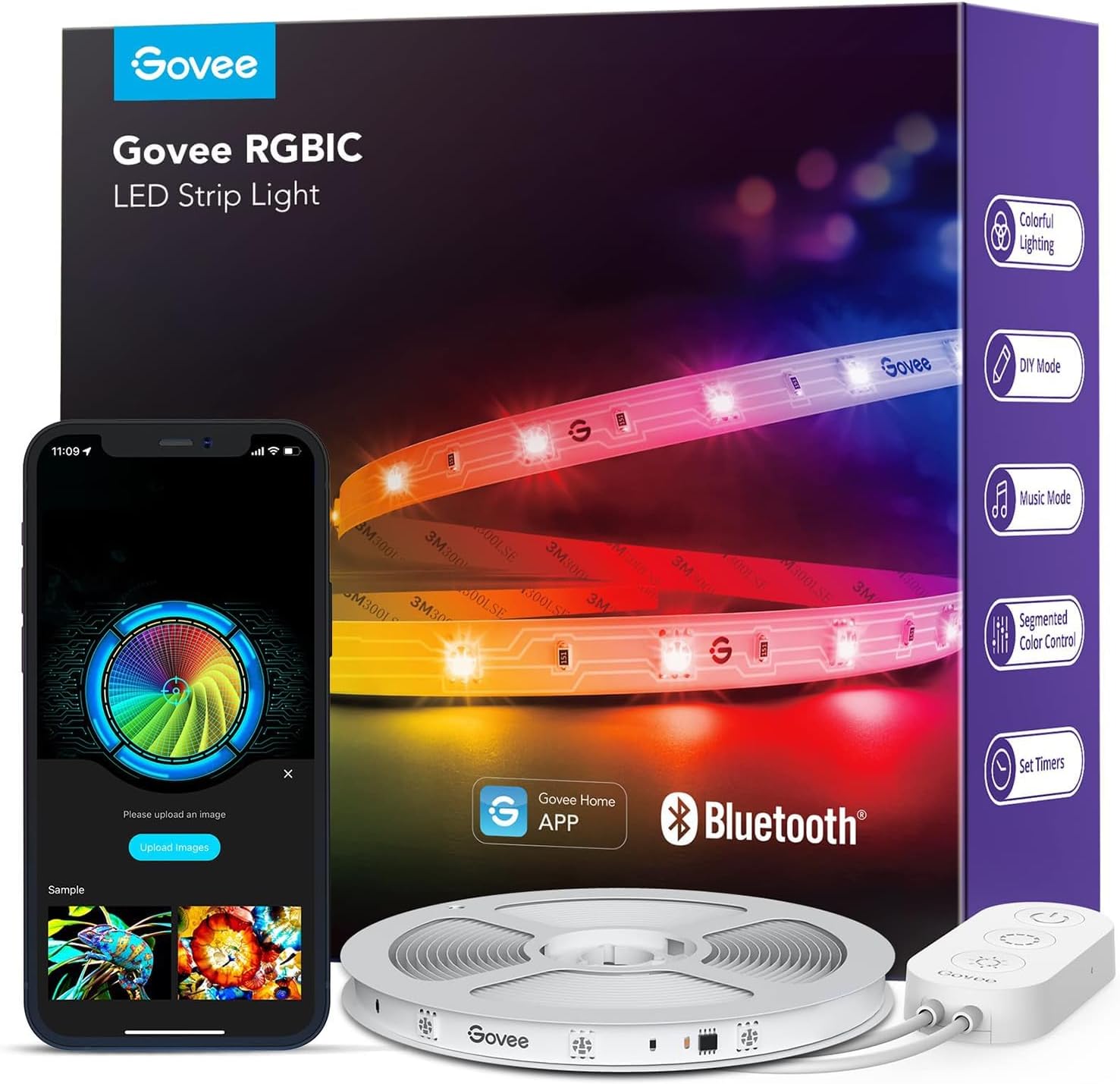
2. Govee LED Strip RGBIC — LED-Strip-Klassiker
Die Govee LED Strip RGBIC ist der bestverkaufte LED-Strip Deutschlands . RGBIC (independent control pro Pixel) bedeutet: jeder LED-Punkt kann eine andere Farbe haben — Effekte wie Regenbogen, Wasserwellen, Sonnenuntergang sind möglich.
Stärken:
RGBIC (16 Millionen Farben pro Pixel)
Verlängerbar (1-30 m)
Sync-to-Music und Sync-to-Game (über App)
Sehr günstig vs. Hue Lightstrip
→ Vollständige Govee LED Strip Rezension lesen
3-4. Govee Floor Lamp + Meross E27 — Spezial-Picks
Govee RGBIC Floor Lamp: Stehlampe mit eingebauten RGBIC-LEDs — Wand-Beleuchtung als Premium-Statement. Govee Floor Lamp Rezension .
Meross Smart Bulb E27: Apple-HomeKit-Pick. Bessere Apple-Home-Integration als Govee, etwas teurer pro Lampe aber Apple-Ökosystem-optimiert. Meross Smart Bulb Rezension .
Worauf du beim Kauf achten solltest
WLAN vs. Bridge. WLAN-Lampen (Govee, Meross) brauchen keine Extra-Bridge — sparen 40-100 €. Bridge-Lampen (Hue, Innr) sind reaktionsschneller bei großen Setups (10+ Lampen).
Matter-Support. 2026 ist Pflicht für Multi-Ökosystem-Setups. Govee hat Matter, Meross hat HomeKit + Matter. Hue hat alles, ist aber teurer.
RGBIC vs. nur RGB. RGBIC = jeder Pixel anders, ermöglicht Effekte. RGB = ganzer LED-Strip in einer Farbe. Für Ambient-Beleuchtung RGBIC unbedingt.
Farb-Genauigkeit. Govee und Meross liegen 10-15 % unter Hue bei Farb-Wiedergabe (RA-Index). Für Wohnzimmer-Ambient irrelevant. Für Foto/Video-Beleuchtung bevorzugt Hue.
Mehr Hintergrund: Smarte Beleuchtung über alle Klassen und Wann lohnt sich Sprachassistent .
Häufige Fragen
Lohnt sich Philips Hue vs. Govee? Bei kleinen Setups (1-3 Lampen) nicht — Govee ist 70 % günstiger und vergleichbar. Bei großen Setups (10+ Lampen, mehrere Räume) lohnt Hue wegen Bridge-Stabilität und besserer Farbqualität.
Brauche ich für Govee einen Bridge oder Hub? Nein, Govee funktioniert direkt über WLAN. Für Apple Home brauchst du einen Apple TV oder HomePod als Matter-Hub — das ist aber kein extra Govee-Bridge.
Welcher LED-Strip ist am besten? Govee RGBIC ist der Klassen-Sieger 2026. Hue Lightstrip Plus ist marginal besser bei Farb-Wiedergabe, aber doppelt so teuer. Für Wohnzimmer-Ambient ist Govee die richtige Wahl.
Kann ich Hue und Govee parallel nutzen? Ja, über Alexa / Apple Home / Google Home. Die Marken sehen sich nicht direkt — aber Routinen können Lampen beider Marken steuern (z.B. „Filmzeit“ → Hue + Govee gleichzeitig).
Sind günstige Smart-Bulbs sicher? Govee und Meross sind etabliert (CE-Zertifiziert, deutsche Vertretung). Discounter-Bulbs unter 8 € haben oft Sicherheitsrisiken (Phishing-Cloud, fehlende CE). Bei den Markennamen oben aber kein Problem.
Wie viel Strom verbraucht eine Smart-Bulb im Standby? Govee/Meross: 0,3-0,5 W. Hue: 0,4 W. Bei 24/7 Standby: ca. 3 €/Jahr pro Lampe. Vernachlässigbar.
Fazit
Für 80 % der Käufer ist Govee die richtige Hue-Alternative — beste Mischung aus Preis, Features und Multi-Ökosystem-Support. Apple-Home-Fans: Meross . LED-Strip-Klassiker: Govee RGBIC . Premium-Stehlampe: Govee Floor Lamp .
Vermeide: Discounter-Smart-Bulbs unter 8 € (Sicherheitsrisiko), nur-Bluetooth-Lampen (keine App-Steuerung von außerhalb), oder Marken ohne Matter-Support (Zukunftsproblem).
Um dir ein optimales Erlebnis zu bieten, verwenden wir Technologien wie Cookies, um Geräteinformationen zu speichern und/oder darauf zuzugreifen. Wenn du diesen Technologien zustimmst, können wir Daten wie das Surfverhalten oder eindeutige IDs auf dieser Website verarbeiten. Wenn du deine Einwillligung nicht erteilst oder zurückziehst, können bestimmte Merkmale und Funktionen beeinträchtigt werden.
Die technische Speicherung oder der Zugang ist unbedingt erforderlich für den rechtmäßigen Zweck, die Nutzung eines bestimmten Dienstes zu ermöglichen, der vom Teilnehmer oder Nutzer ausdrücklich gewünscht wird, oder für den alleinigen Zweck, die Übertragung einer Nachricht über ein elektronisches Kommunikationsnetz durchzuführen.
Die technische Speicherung oder der Zugriff ist für den rechtmäßigen Zweck der Speicherung von Präferenzen erforderlich, die nicht vom Abonnenten oder Benutzer angefordert wurden.
Die technische Speicherung oder der Zugriff, der ausschließlich zu statistischen Zwecken erfolgt.
Die technische Speicherung oder der Zugriff, der ausschließlich zu anonymen statistischen Zwecken verwendet wird. Ohne eine Vorladung, die freiwillige Zustimmung deines Internetdienstanbieters oder zusätzliche Aufzeichnungen von Dritten können die zu diesem Zweck gespeicherten oder abgerufenen Informationen allein in der Regel nicht dazu verwendet werden, dich zu identifizieren.
Die technische Speicherung oder der Zugriff ist erforderlich, um Nutzerprofile zu erstellen, um Werbung zu versenden oder um den Nutzer auf einer Website oder über mehrere Websites hinweg zu ähnlichen Marketingzwecken zu verfolgen.
Einwilligung verwalten