(function(){function run(){var list=document.querySelector(‚.lg-list‘);if(!list){setTimeout(run,120);return;}var ex=list.getElementsByTagName(‚a‘);for(var j=0;j<ex.length;j++){if(ex[j].getAttribute('href')==='/unser-team/')return;}var items=list.querySelectorAll('.lg-item');var bestOf=null;for(var i=0;i<items.length;i++){if(items[i].textContent.indexOf('Best of')!==-1){bestOf=items[i];break;}}var li=document.createElement('li');li.className='lg-item';var a=document.createElement('a');a.className='lg-row';a.href='/unser-team/';a.textContent='Unser Team';li.appendChild(a);if(bestOf)list.insertBefore(li,bestOf);else list.appendChild(li);}if(document.readyState==='loading')document.addEventListener('DOMContentLoaded',function(){setTimeout(run,150)});else setTimeout(run,150);})();
/* ============================================================
LUNA GOODS — Affiliate Homepage
Aesthetic: Cool editorial · Mist + Deep Navy + Sky
============================================================ */
:root {
–bg: #BFD3E6;
–bg-2: #9DB8D1;
–bg-card: #EDF3F9;
–ink: #0B1A2D;
–ink-soft: #233A57;
–ink-muted: #5A7A99;
–rule: #8FA9C3;
–accent: #1E4FAE;
–accent-2: #0F2B4A;
–accent-3: #E6B547;
–sand: #A8C0D8;
–font-display: ‚Fraunces‘, Georgia, serif;
–font-sans: ‚DM Sans‘, system-ui, sans-serif;
–font-mono: ‚JetBrains Mono‘, ui-monospace, monospace;
–radius: 12px;
–radius-lg: 20px;
–shadow-sm: 0 1px 2px rgba(30,26,20,.06);
–shadow-md: 0 8px 24px -10px rgba(30,26,20,.18);
}
/* — Variant 2: Cool Minimal — */
[data-variant=“minimal“] {
–bg: #F2F6FA;
–bg-2: #F2F6FA;
–bg-card: #FFFFFF;
–ink: #0A1220;
–ink-soft: #283449;
–ink-muted: #7388A0;
–rule: #DDE7F1;
–accent: #1E4AA6;
–accent-2: #141C2A;
–accent-3: #6EA9D4;
–sand: #E8EFF6;
–radius: 2px;
–radius-lg: 4px;
}
/* — Variant 3: Deep Ocean Maximalist — */
[data-variant=“cozy“] {
–bg: #BFD3E6;
–bg-2: #9DB8D1;
–bg-card: #EDF3F9;
–ink: #0B1A2D;
–ink-soft: #233A57;
–ink-muted: #5A7A99;
–rule: #8FA9C3;
–accent: #1E4FAE;
–accent-2: #0F2B4A;
–accent-3: #E6B547;
–sand: #A8C0D8;
–radius: 12px;
–radius-lg: 20px;
}
* { box-sizing: border-box; margin: 0; padding: 0; }
html, body {
background: var(–bg);
color: var(–ink);
font-family: var(–font-sans);
font-size: 16px;
line-height: 1.55;
-webkit-font-smoothing: antialiased;
overflow-x: hidden;
}
body::before {
content: „“;
position: fixed; inset: 0;
pointer-events: none;
background-image:
radial-gradient(rgba(30,26,20,.035) 1px, transparent 1px);
background-size: 3px 3px;
opacity: .7;
z-index: 1;
mix-blend-mode: multiply;
}
img { max-width: 100%; display: block; }
a { color: inherit; text-decoration: none; }
button { font-family: inherit; cursor: pointer; border: none; background: none; color: inherit; }
/* ============================================================
PLACEHOLDER SYSTEM — striped bg + mono label
============================================================ */
.ph {
position: relative;
background-color: var(–sand);
background-image: repeating-linear-gradient(
135deg,
transparent 0, transparent 14px,
rgba(30,26,20,.06) 14px, rgba(30,26,20,.06) 15px
);
border-radius: var(–radius);
display: flex; align-items: center; justify-content: center;
overflow: hidden;
color: var(–ink-soft);
}
.ph::after {
content: attr(data-label);
font-family: var(–font-mono);
font-size: 10px;
letter-spacing: 0.08em;
text-transform: uppercase;
padding: 4px 8px;
background: var(–bg-card);
border: 1px solid var(–rule);
border-radius: 2px;
opacity: .85;
}
/* ============================================================
AFFILIATE DISCLOSURE BAR
============================================================ */
.disclosure {
background: var(–accent-2);
color: #E8E1CF;
font-size: 12px;
text-align: center;
padding: 8px 16px;
font-family: var(–font-mono);
letter-spacing: 0.04em;
position: relative;
z-index: 10;
}
.disclosure strong { color: var(–accent-3); font-weight: 500; }
/* ============================================================
NAV
============================================================ */
.nav {
position: sticky; top: 0;
background: var(–bg);
border-bottom: 1px solid var(–rule);
z-index: 20;
backdrop-filter: blur(8px);
background: color-mix(in oklab, var(–bg) 88%, transparent);
}
.nav-inner {
max-width: 1360px;
margin: 0 auto;
padding: 18px 40px;
display: grid;
grid-template-columns: auto 1fr auto;
gap: 48px;
align-items: center;
}
.logo {
display: flex; align-items: center; gap: 10px;
font-family: var(–font-display);
font-size: 22px;
font-weight: 600;
letter-spacing: -0.02em;
}
.logo-mark {
width: 56px; height: 56px;
display: grid; place-items: center;
}
.logo-mark svg { width: 100%; height: 100%; }
.nav-links {
display: flex; gap: 32px;
font-size: 14px;
font-weight: 500;
}
.nav-links a {
position: relative;
padding: 6px 0;
transition: color .2s;
}
.nav-links a:hover { color: var(–accent); }
.nav-search {
display: flex; align-items: center;
gap: 20px;
}
.search-box {
display: flex; align-items: center; gap: 8px;
background: var(–bg-card);
border: 1px solid var(–rule);
padding: 8px 14px;
border-radius: var(–radius-lg);
font-size: 13px;
color: var(–ink-muted);
min-width: 220px;
transition: border-color .2s;
}
.search-box:focus-within { border-color: var(–accent); }
.search-box input {
border: none; outline: none;
background: transparent;
font-family: inherit;
font-size: 13px;
color: var(–ink);
width: 100%;
}
/* ============================================================
HERO
============================================================ */
.hero {
max-width: 1360px;
margin: 0 auto;
padding: 40px 40px 80px;
position: relative;
}
.hero-meta {
display: flex; align-items: center; gap: 16px;
font-family: var(–font-mono);
font-size: 11px;
letter-spacing: 0.12em;
text-transform: uppercase;
color: var(–ink-muted);
margin-bottom: 24px;
}
.hero-meta .dot {
width: 4px; height: 4px; background: var(–accent); border-radius: 50%;
}
.hero-grid {
display: grid;
grid-template-columns: 1.2fr 1fr;
gap: 48px;
align-items: end;
}
.hero-headline {
font-family: var(–font-display);
font-size: clamp(56px, 7vw, 104px);
line-height: 0.95;
letter-spacing: -0.035em;
font-weight: 400;
color: var(–ink);
}
.hero-headline em {
font-style: italic;
font-weight: 300;
color: var(–accent);
}
.hero-headline .underline {
position: relative;
display: inline-block;
}
.hero-headline .underline::after {
content: „“;
position: absolute;
left: 0; right: 0; bottom: 6px;
height: 10px;
background: var(–accent-3);
opacity: .35;
z-index: -1;
}
.hero-side {
display: flex; flex-direction: column; gap: 24px;
padding-bottom: 12px;
}
.hero-lede {
font-size: 17px;
line-height: 1.55;
color: var(–ink-soft);
max-width: 44ch;
font-weight: 400;
}
.hero-cta-row {
display: flex; gap: 12px; align-items: center; flex-wrap: wrap;
}
.btn {
display: inline-flex; align-items: center; gap: 8px;
padding: 14px 22px;
border-radius: var(–radius-lg);
font-weight: 500;
font-size: 14px;
letter-spacing: 0.01em;
transition: transform .15s ease, background .2s, box-shadow .2s;
}
.btn-primary {
background: var(–ink);
color: var(–bg-card);
}
.btn-primary:hover {
background: var(–accent);
transform: translateY(-1px);
}
.btn-secondary {
background: transparent;
color: var(–ink);
border: 1px solid var(–ink);
}
.btn-secondary:hover {
background: var(–ink);
color: var(–bg-card);
}
.hero-visual {
margin-top: 56px;
display: grid;
grid-template-columns: 1.5fr 1fr 1fr;
grid-template-rows: 280px 180px;
gap: 12px;
}
.hero-img-1 { grid-row: 1 / 3; }
.hero-img-2 { grid-column: 2; grid-row: 1; }
.hero-img-3 { grid-column: 3; grid-row: 1; }
.hero-img-4 { grid-column: 2 / 4; grid-row: 2; }
.hero-stats {
margin-top: 56px;
display: grid;
grid-template-columns: repeat(4, 1fr);
border-top: 1px solid var(–rule);
border-bottom: 1px solid var(–rule);
padding: 28px 0;
}
.stat {
padding: 0 24px;
border-right: 1px solid var(–rule);
}
.stat:last-child { border-right: none; }
.stat-num {
font-family: var(–font-display);
font-size: 44px;
line-height: 1;
letter-spacing: -0.03em;
font-weight: 400;
color: var(–ink);
margin-bottom: 6px;
}
.stat-num em { font-style: italic; color: var(–accent); }
.stat-label {
font-family: var(–font-mono);
font-size: 11px;
letter-spacing: 0.1em;
text-transform: uppercase;
color: var(–ink-muted);
}
/* ============================================================
DEAL BANNER
============================================================ */
.deal {
max-width: 1360px;
margin: 0 auto 80px;
padding: 0 40px;
}
.deal-inner {
background: var(–accent-2);
color: #E8E1CF;
border-radius: var(–radius-lg);
padding: 32px 40px;
display: grid;
grid-template-columns: auto 1fr auto auto;
align-items: center;
gap: 32px;
position: relative;
overflow: hidden;
}
.deal-inner::before {
content: „DEAL · DEAL · DEAL · DEAL · DEAL · DEAL · DEAL · DEAL · „;
position: absolute;
top: -14px; left: 0; right: 0;
font-family: var(–font-display);
font-style: italic;
font-size: 160px;
line-height: 1;
color: rgba(232, 225, 207, .04);
white-space: nowrap;
pointer-events: none;
font-weight: 300;
}
.deal-tag {
font-family: var(–font-mono);
font-size: 11px;
letter-spacing: 0.15em;
text-transform: uppercase;
padding: 6px 12px;
border: 1px solid var(–accent-3);
color: var(–accent-3);
border-radius: 2px;
position: relative; z-index: 1;
}
.deal-text { position: relative; z-index: 1; }
.deal-text h2 {
font-family: var(–font-display);
font-size: 28px;
line-height: 1.15;
font-weight: 500;
letter-spacing: -0.015em;
margin-bottom: 4px;
}
.deal-text p {
font-size: 13px;
color: #C8BFA8;
}
.deal-price {
position: relative; z-index: 1;
text-align: right;
}
.deal-price .old {
font-size: 13px;
color: #A89E85;
text-decoration: line-through;
margin-bottom: 2px;
}
.deal-price .new {
font-family: var(–font-display);
font-size: 36px;
line-height: 1;
color: var(–accent-3);
font-weight: 500;
}
.deal-btn {
position: relative; z-index: 1;
background: var(–accent-3);
color: var(–accent-2);
padding: 14px 22px;
border-radius: var(–radius-lg);
font-weight: 600;
font-size: 14px;
display: inline-flex; gap: 8px; align-items: center;
transition: transform .15s;
}
.deal-btn:hover { transform: translateY(-1px); }
/* ============================================================
CATEGORY SECTION
============================================================ */
.category {
max-width: 1360px;
margin: 0 auto;
padding: 0 40px 100px;
position: relative;
}
.cat-header {
display: grid;
grid-template-columns: 1fr 1fr;
gap: 48px;
align-items: end;
margin-bottom: 48px;
padding-bottom: 28px;
border-bottom: 1px solid var(–rule);
}
.cat-eyebrow {
display: flex; align-items: center; gap: 14px;
font-family: var(–font-mono);
font-size: 11px;
letter-spacing: 0.15em;
text-transform: uppercase;
color: var(–ink-muted);
margin-bottom: 16px;
}
.cat-num {
font-family: var(–font-display);
font-style: italic;
font-size: 14px;
font-weight: 500;
color: var(–accent);
}
.cat-title {
font-family: var(–font-display);
font-size: clamp(44px, 5.5vw, 72px);
line-height: 0.98;
letter-spacing: -0.03em;
font-weight: 400;
}
.cat-title em { font-style: italic; color: var(–accent); font-weight: 300; }
.cat-intro {
display: flex; flex-direction: column; gap: 18px;
padding-bottom: 8px;
}
.cat-intro p {
font-size: 15px;
color: var(–ink-soft);
line-height: 1.6;
max-width: 50ch;
}
.cat-expert {
display: flex; gap: 12px; align-items: center;
padding-top: 14px;
border-top: 1px solid var(–rule);
}
.expert-avatar {
width: 40px; height: 40px;
border-radius: 50%;
background: var(–sand);
background-image: repeating-linear-gradient(135deg, transparent 0 6px, rgba(30,26,20,.06) 6px 7px);
flex-shrink: 0;
}
.expert-meta {
font-size: 12px;
color: var(–ink-muted);
}
.expert-meta strong { color: var(–ink); display: block; font-weight: 600; }
.cat-filters {
display: flex; gap: 8px; flex-wrap: wrap;
margin-bottom: 32px;
}
.chip {
padding: 7px 14px;
background: var(–bg-card);
border: 1px solid var(–rule);
border-radius: 99px;
font-size: 12px;
font-weight: 500;
color: var(–ink-soft);
transition: all .2s;
cursor: pointer;
font-family: var(–font-sans);
}
.chip:hover, .chip.active {
background: var(–ink);
color: var(–bg-card);
border-color: var(–ink);
}
/* ============================================================
PRODUCT GRID
============================================================ */
.products {
display: grid;
grid-template-columns: repeat(3, 1fr);
gap: 24px;
}
.product {
background: var(–bg-card);
border: 1px solid var(–rule);
border-radius: var(–radius-lg);
overflow: hidden;
display: flex; flex-direction: column;
transition: transform .2s ease, box-shadow .25s ease;
position: relative;
}
.product:hover {
transform: translateY(-3px);
box-shadow: var(–shadow-md);
}
.product-img {
aspect-ratio: 4/3;
margin: 0;
border-radius: 0;
border-bottom: 1px solid var(–rule);
}
.product-badge {
position: absolute;
top: 14px; left: 14px;
background: var(–bg-card);
border: 1px solid var(–ink);
font-family: var(–font-mono);
font-size: 10px;
letter-spacing: 0.1em;
text-transform: uppercase;
padding: 4px 8px;
border-radius: 2px;
z-index: 2;
font-weight: 500;
}
.product-badge.tested {
background: var(–accent-2);
color: var(–accent-3);
border-color: var(–accent-2);
}
.product-badge.top {
background: var(–accent);
color: #fff;
border-color: var(–accent);
}
.product-body {
padding: 20px 22px 22px;
display: flex; flex-direction: column;
gap: 10px;
flex: 1;
}
.product-cat {
font-family: var(–font-mono);
font-size: 10px;
letter-spacing: 0.12em;
text-transform: uppercase;
color: var(–ink-muted);
}
.product-title {
font-family: var(–font-display);
font-size: 22px;
line-height: 1.15;
font-weight: 500;
letter-spacing: -0.01em;
}
.product-review {
font-size: 13.5px;
color: var(–ink-soft);
line-height: 1.5;
flex: 1;
}
.product-rating {
display: flex; align-items: center; gap: 10px;
padding-top: 4px;
}
.stars {
display: flex; gap: 2px;
color: var(–accent-3);
font-size: 14px;
letter-spacing: 1px;
}
.rating-num {
font-family: var(–font-mono);
font-size: 12px;
color: var(–ink-muted);
}
.product-footer {
display: grid;
grid-template-columns: auto 1fr;
gap: 12px;
align-items: center;
padding-top: 14px;
border-top: 1px solid var(–rule);
margin-top: 8px;
}
.product-price {
font-family: var(–font-display);
font-size: 22px;
font-weight: 500;
letter-spacing: -0.01em;
}
.product-price .from {
font-family: var(–font-mono);
font-size: 10px;
letter-spacing: 0.1em;
text-transform: uppercase;
color: var(–ink-muted);
display: block;
font-weight: 400;
margin-bottom: -2px;
}
.check-price {
background: var(–ink);
color: var(–bg-card);
padding: 11px 16px;
border-radius: var(–radius);
font-size: 13px;
font-weight: 500;
display: inline-flex; align-items: center; gap: 6px;
justify-content: center;
transition: background .2s;
}
.check-price:hover { background: var(–accent); }
.check-price svg { transition: transform .2s; }
.check-price:hover svg { transform: translate(2px, -2px); }
.cat-footer {
margin-top: 32px;
display: flex; justify-content: space-between; align-items: center;
padding: 20px 0;
border-top: 1px solid var(–rule);
font-size: 13px;
color: var(–ink-muted);
}
.cat-footer a {
color: var(–accent);
font-weight: 500;
display: inline-flex; align-items: center; gap: 6px;
}
/* ============================================================
COMPARISON TABLE (inside category 2)
============================================================ */
.compare {
margin-top: 48px;
background: var(–bg-card);
border: 1px solid var(–rule);
border-radius: var(–radius-lg);
overflow: hidden;
}
.compare-head {
padding: 24px 28px;
border-bottom: 1px solid var(–rule);
display: flex; justify-content: space-between; align-items: center;
background: var(–bg-2);
}
.compare-head h4 {
font-family: var(–font-display);
font-size: 22px;
font-weight: 500;
letter-spacing: -0.01em;
}
.compare-head .pill {
font-family: var(–font-mono);
font-size: 10px;
letter-spacing: 0.12em;
text-transform: uppercase;
padding: 5px 10px;
background: var(–accent);
color: #fff;
border-radius: 2px;
}
.compare table {
width: 100%;
border-collapse: collapse;
font-size: 14px;
}
.compare th, .compare td {
padding: 16px 20px;
text-align: left;
border-bottom: 1px solid var(–rule);
vertical-align: middle;
}
.compare th {
font-family: var(–font-mono);
font-size: 10px;
letter-spacing: 0.12em;
text-transform: uppercase;
color: var(–ink-muted);
font-weight: 500;
background: var(–bg-2);
}
.compare tr:last-child td { border-bottom: none; }
.compare td.prod {
font-family: var(–font-display);
font-size: 16px;
font-weight: 500;
}
.compare td.price {
font-family: var(–font-mono);
font-weight: 500;
color: var(–accent);
}
.compare .mini-stars { color: var(–accent-3); letter-spacing: 1px; font-size: 13px; }
.compare tbody tr:hover { background: var(–bg-2); }
.compare .go {
padding: 8px 14px;
background: var(–ink);
color: var(–bg-card);
border-radius: var(–radius);
font-size: 12px;
font-weight: 500;
display: inline-flex; align-items: center; gap: 6px;
}
/* ============================================================
PULL QUOTE / EXPERT QUOTE
============================================================ */
.pullquote {
max-width: 1360px;
margin: 0 auto 100px;
padding: 0 40px;
}
.pullquote-inner {
background: var(–bg-card);
border-left: 3px solid var(–accent);
padding: 48px 56px;
display: grid;
grid-template-columns: auto 1fr;
gap: 40px;
align-items: center;
border-radius: 0 var(–radius-lg) var(–radius-lg) 0;
}
.quote-mark {
font-family: var(–font-display);
font-style: italic;
font-size: 120px;
line-height: 0.7;
color: var(–accent);
font-weight: 300;
}
.quote-text {
font-family: var(–font-display);
font-size: 28px;
line-height: 1.25;
letter-spacing: -0.01em;
font-weight: 400;
color: var(–ink);
font-style: italic;
}
.quote-author {
margin-top: 20px;
display: flex; align-items: center; gap: 14px;
font-size: 13px;
color: var(–ink-muted);
font-style: normal;
}
.quote-author strong { color: var(–ink); font-weight: 600; }
/* ============================================================
GUIDES / BLOG
============================================================ */
.guides {
max-width: 1360px;
margin: 0 auto;
padding: 0 40px 100px;
}
.section-head {
display: grid;
grid-template-columns: 1fr auto;
align-items: end;
margin-bottom: 40px;
padding-bottom: 24px;
border-bottom: 1px solid var(–rule);
}
.section-head h2 {
font-family: var(–font-display);
font-size: clamp(40px, 4.5vw, 56px);
line-height: 1;
letter-spacing: -0.03em;
font-weight: 400;
}
.section-head h2 em { font-style: italic; color: var(–accent); font-weight: 300; }
.section-head .see-all {
font-family: var(–font-mono);
font-size: 11px;
letter-spacing: 0.12em;
text-transform: uppercase;
color: var(–ink-muted);
display: inline-flex; gap: 6px; align-items: center;
}
.guides-grid {
display: grid;
grid-template-columns: 2fr 1fr 1fr;
gap: 24px;
}
.guide {
display: flex; flex-direction: column;
gap: 16px;
transition: opacity .2s;
}
.guide:hover { opacity: .85; }
.guide:hover .guide-title { color: var(–accent); }
.guide-img {
aspect-ratio: 4/3;
border-radius: var(–radius-lg);
}
.guide.hero-guide .guide-img { aspect-ratio: 4/3.2; }
.guide-meta {
display: flex; gap: 10px; align-items: center;
font-family: var(–font-mono);
font-size: 11px;
letter-spacing: 0.08em;
text-transform: uppercase;
color: var(–ink-muted);
}
.guide-meta .tag {
padding: 3px 8px;
background: var(–sand);
color: var(–ink);
border-radius: 2px;
}
.guide-title {
font-family: var(–font-display);
font-size: 24px;
line-height: 1.15;
letter-spacing: -0.015em;
font-weight: 500;
transition: color .2s;
}
.guide.hero-guide .guide-title { font-size: 36px; }
.guide-desc {
font-size: 14px;
color: var(–ink-soft);
line-height: 1.55;
}
/* ============================================================
FAQ
============================================================ */
.faq {
max-width: 1360px;
margin: 0 auto;
padding: 0 40px 100px;
display: grid;
grid-template-columns: 1fr 1.5fr;
gap: 64px;
align-items: start;
}
.faq-side h2 {
font-family: var(–font-display);
font-size: clamp(40px, 4.5vw, 56px);
line-height: 1;
letter-spacing: -0.03em;
font-weight: 400;
margin-bottom: 20px;
}
.faq-side h2 em { font-style: italic; color: var(–accent); font-weight: 300; }
.faq-side p {
font-size: 15px;
color: var(–ink-soft);
line-height: 1.6;
margin-bottom: 24px;
max-width: 36ch;
}
.faq-list {
border-top: 1px solid var(–rule);
}
.faq-item {
border-bottom: 1px solid var(–rule);
}
.faq-q {
width: 100%;
padding: 22px 0;
display: grid;
grid-template-columns: 1fr auto;
align-items: center;
gap: 24px;
text-align: left;
font-family: var(–font-display);
font-size: 20px;
font-weight: 500;
letter-spacing: -0.01em;
color: var(–ink);
transition: color .2s;
}
.faq-q:hover { color: var(–accent); }
.faq-icon {
width: 28px; height: 28px;
border: 1px solid var(–rule);
border-radius: 50%;
display: grid; place-items: center;
transition: all .25s;
flex-shrink: 0;
}
.faq-icon::before {
content: „+“;
font-family: var(–font-sans);
font-weight: 400;
font-size: 18px;
color: var(–ink-soft);
transition: transform .25s;
}
.faq-item.open .faq-icon {
background: var(–ink);
border-color: var(–ink);
}
.faq-item.open .faq-icon::before {
transform: rotate(45deg);
color: var(–bg-card);
}
.faq-a {
max-height: 0;
overflow: hidden;
transition: max-height .35s ease;
color: var(–ink-soft);
font-size: 15px;
line-height: 1.6;
}
.faq-item.open .faq-a {
max-height: 260px;
padding-bottom: 22px;
}
/* ============================================================
NEWSLETTER / FOOTER
============================================================ */
.newsletter {
background: var(–accent-2);
color: #E8E1CF;
padding: 80px 40px;
position: relative;
overflow: hidden;
}
.newsletter-inner {
max-width: 1360px;
margin: 0 auto;
display: grid;
grid-template-columns: 1fr 1fr;
gap: 64px;
align-items: center;
position: relative;
z-index: 1;
}
.newsletter h2 {
font-family: var(–font-display);
font-size: clamp(40px, 4.5vw, 64px);
line-height: 1;
letter-spacing: -0.03em;
font-weight: 400;
}
.newsletter h2 em { font-style: italic; color: var(–accent-3); font-weight: 300; }
.newsletter p {
font-size: 15px;
color: #C8BFA8;
margin-top: 16px;
max-width: 42ch;
}
.newsletter-form {
display: grid;
gap: 12px;
}
.nl-row {
display: grid;
grid-template-columns: 1fr auto;
gap: 8px;
background: rgba(232, 225, 207, .08);
border: 1px solid rgba(232, 225, 207, .15);
border-radius: var(–radius-lg);
padding: 4px;
}
.nl-row input {
background: transparent;
border: none; outline: none;
padding: 14px 16px;
color: #E8E1CF;
font-family: inherit;
font-size: 15px;
}
.nl-row input::placeholder { color: #8A8166; }
.nl-btn {
background: var(–accent-3);
color: var(–accent-2);
padding: 12px 22px;
border-radius: calc(var(–radius-lg) – 2px);
font-weight: 600;
font-size: 14px;
transition: background .2s;
}
.nl-btn:hover { background: #F0B64D; }
.nl-note {
font-family: var(–font-mono);
font-size: 11px;
letter-spacing: 0.08em;
color: #8A8166;
display: flex; gap: 10px; align-items: center;
}
footer {
background: var(–ink);
color: #B8AE95;
padding: 64px 40px 32px;
font-size: 13px;
}
.foot-inner {
max-width: 1360px;
margin: 0 auto;
display: grid;
grid-template-columns: 2fr 1fr 1fr 1fr;
gap: 48px;
padding-bottom: 48px;
border-bottom: 1px solid rgba(184, 174, 149, .15);
}
.foot-brand .logo { color: var(–bg-card); margin-bottom: 14px; }
.foot-brand p { max-width: 36ch; line-height: 1.6; }
.foot-col .foot-col-title {
font-family: var(–font-mono);
font-size: 11px;
letter-spacing: 0.12em;
text-transform: uppercase;
color: var(–bg-card);
margin-bottom: 18px;
font-weight: 500;
}
.foot-col ul { list-style: none; display: flex; flex-direction: column; gap: 10px; }
.foot-col a:hover { color: var(–accent-3); }
.foot-bottom {
max-width: 1360px;
margin: 32px auto 0;
display: flex; justify-content: space-between;
font-family: var(–font-mono);
font-size: 11px;
letter-spacing: 0.08em;
color: #6F6650;
}
/* ============================================================
TWEAKS PANEL
============================================================ */
.tweaks-panel {
position: fixed;
bottom: 24px; right: 24px;
width: 300px;
background: var(–bg-card);
border: 1px solid var(–rule);
border-radius: var(–radius-lg);
box-shadow: 0 20px 50px -10px rgba(30,26,20,.25);
z-index: 100;
padding: 18px;
display: none;
font-family: var(–font-sans);
}
.tweaks-panel.open { display: block; }
.tweaks-panel h4 {
font-family: var(–font-display);
font-size: 16px;
font-weight: 600;
margin-bottom: 4px;
display: flex; justify-content: space-between; align-items: center;
}
.tweaks-panel .sub {
font-size: 11px;
color: var(–ink-muted);
font-family: var(–font-mono);
letter-spacing: 0.08em;
text-transform: uppercase;
margin-bottom: 14px;
}
.tweak-row {
display: grid;
gap: 6px;
margin-bottom: 14px;
}
.tweak-row label {
font-size: 11px;
font-family: var(–font-mono);
letter-spacing: 0.08em;
text-transform: uppercase;
color: var(–ink-muted);
}
.tweak-variants {
display: grid;
grid-template-columns: 1fr 1fr 1fr;
gap: 6px;
}
.tweak-variants button {
padding: 10px 8px;
border: 1px solid var(–rule);
border-radius: var(–radius);
font-size: 12px;
background: var(–bg);
font-weight: 500;
transition: all .2s;
}
.tweak-variants button.active {
background: var(–ink);
color: var(–bg-card);
border-color: var(–ink);
}
/* ============================================================
SCROLL REVEAL
============================================================ */
.reveal {
opacity: 0;
transform: translateY(20px);
transition: opacity .8s ease, transform .8s ease;
}
.reveal.in {
opacity: 1;
transform: translateY(0);
}
/* ============================================================
RESPONSIVE
============================================================ */
@media (max-width: 900px) {
.hero-grid, .cat-header, .faq, .newsletter-inner, .foot-inner, .pullquote-inner { grid-template-columns: 1fr; gap: 32px; }
.products, .guides-grid { grid-template-columns: 1fr; }
.hero-stats { grid-template-columns: repeat(2, 1fr); }
.stat { border-right: none; padding: 16px 0; border-bottom: 1px solid var(–rule); }
.nav-inner { grid-template-columns: 1fr; gap: 16px; padding: 16px 20px; }
.nav-links { display: none; }
.deal-inner { grid-template-columns: 1fr; text-align: left; }
.hero, .deal, .category, .pullquote, .guides, .faq { padding-left: 20px; padding-right: 20px; }
}
/* LUNA GOODS — Astra/Elementor override */
html, body,
body.elementor-default,
body.ast-theme-transparent-header,
.ast-plain-container, .ast-container,
.site, #page, #content, .site-content, .hfeed {
background: var(–bg) !important;
}
.luna-goods-design {
background: var(–bg);
}
.luna-goods-design .hero-link {
display: block;
text-decoration: none;
cursor: pointer;
position: relative;
transition: transform .25s ease, box-shadow .25s ease;
}
.luna-goods-design .hero-link:hover {
transform: translateY(-3px);
box-shadow: var(–shadow-md);
}
.luna-goods-design .hero-link::after {
/* data-label weiterhin sichtbar wie bei .ph */
}
/* LUNA GOODS — Reveal-Override + Kachel-Tuning */
.luna-goods-design .reveal { opacity: 1 !important; transform: none !important; }
.luna-goods-design .guide-img { aspect-ratio: 16/10; }
.luna-goods-design .hero-guide .guide-img { aspect-ratio: 16/10; }
.luna-goods-design .guide-title { font-size: 19px; line-height: 1.3; }
.luna-goods-design .hero-guide .guide-title { font-size: 28px; line-height: 1.2; }
.luna-goods-design .guide-desc { font-size: 13.5px; }
.luna-goods-design .guides-grid { gap: 20px; }
.luna-goods-design .guide { gap: 12px; }
/* LUNA GOODS — Review-Link in Produktkarten */
.luna-goods-design .product-rating { display: flex; align-items: center; gap: 10px; flex-wrap: wrap; }
.luna-goods-design .review-link {
margin-left: auto;
font-family: var(–font-mono);
font-size: 11px;
letter-spacing: .06em;
text-transform: uppercase;
color: var(–accent);
text-decoration: none;
border-bottom: 1px solid transparent;
transition: border-color .2s;
white-space: nowrap;
}
.luna-goods-design .review-link:hover { border-bottom-color: var(–accent); }
/* LUNA GOODS — Dropdown Nav */
.luna-goods-design .nav-links { position: relative; }
.luna-goods-design .nav-item { position: relative; display: inline-block; }
.luna-goods-design .nav-item > a { display: inline-block; }
.luna-goods-design .nav-dropdown {
position: absolute;
top: 100%;
left: -12px;
min-width: 240px;
background: var(–bg-card);
border: 1px solid var(–rule);
border-radius: var(–radius-lg);
padding: 10px;
opacity: 0;
visibility: hidden;
transform: translateY(6px);
transition: opacity .18s ease, transform .18s ease, visibility .18s;
box-shadow: var(–shadow-md);
z-index: 100;
margin-top: 10px;
}
.luna-goods-design .nav-item:hover .nav-dropdown,
.luna-goods-design .nav-dropdown:hover {
opacity: 1;
visibility: visible;
transform: translateY(0);
}
.luna-goods-design .nav-dropdown::before {
content: “;
position: absolute;
top: -10px; left: 0; right: 0; height: 10px;
}
.luna-goods-design .nav-dropdown a {
display: block;
padding: 9px 14px;
color: var(–ink-soft);
text-decoration: none;
font-size: 14px;
border-radius: var(–radius);
transition: background .15s, color .15s;
}
.luna-goods-design .nav-dropdown a:hover {
background: var(–bg);
color: var(–accent);
}
/* LUNA GOODS — Review-Link als Button + Layout-Fix */
.luna-goods-design .product-rating {
display: flex;
align-items: center;
gap: 10px;
flex-wrap: nowrap;
min-width: 0;
}
.luna-goods-design .product-rating .rating-num {
font-size: 12px;
white-space: nowrap;
overflow: hidden;
text-overflow: ellipsis;
min-width: 0;
flex: 1;
}
.luna-goods-design .review-link {
display: inline-flex;
align-items: center;
gap: 6px;
align-self: flex-start;
padding: 7px 12px;
border: 1.5px solid var(–accent);
border-radius: var(–radius);
background: transparent;
font-family: var(–font-mono);
font-size: 11px;
letter-spacing: .06em;
text-transform: uppercase;
color: var(–accent) !important;
text-decoration: none !important;
transition: background .18s ease, color .18s ease;
white-space: nowrap;
margin: 10px 0 4px;
font-weight: 500;
}
.luna-goods-design .review-link:hover {
background: var(–accent);
color: var(–bg-card) !important;
}
/* LUNA GOODS — Featured Product Block (Landing Page) */
.luna-goods-design .featured-product { padding: 3rem 4% 4rem; }
.luna-goods-design .featured-wrap {
max-width: 1200px;
margin: 0 auto;
background: var(–bg-card);
border-radius: var(–radius-lg);
overflow: hidden;
box-shadow: var(–shadow-md);
}
.luna-goods-design .featured-grid {
display: grid;
grid-template-columns: 1.1fr 1fr;
gap: 0;
}
.luna-goods-design .featured-image {
background: var(–bg-2);
display: flex;
align-items: center;
justify-content: center;
padding: 2rem;
}
.luna-goods-design .featured-image img {
width: 100%;
height: auto;
border-radius: var(–radius);
max-height: 520px;
object-fit: cover;
}
.luna-goods-design .featured-content {
padding: 2.5rem;
display: flex;
flex-direction: column;
gap: 1rem;
}
.luna-goods-design .featured-meta {
display: flex;
align-items: center;
gap: 10px;
font-family: var(–font-mono);
font-size: 11px;
letter-spacing: .08em;
text-transform: uppercase;
color: var(–accent);
}
.luna-goods-design .featured-badge {
background: var(–accent);
color: var(–bg-card);
padding: 4px 10px;
border-radius: var(–radius);
}
.luna-goods-design .featured-cat { color: var(–ink-muted); }
.luna-goods-design .featured-content h2 {
font-family: var(–font-display);
font-size: 40px;
line-height: 1.08;
color: var(–ink);
font-weight: 600;
margin: 0;
}
.luna-goods-design .featured-content h2 em { color: var(–accent); font-style: italic; }
.luna-goods-design .featured-lede {
font-size: 16px;
color: var(–ink-soft);
line-height: 1.6;
margin: 0;
}
.luna-goods-design .featured-rating {
display: flex;
align-items: center;
gap: 10px;
margin-top: .5rem;
padding-top: 1rem;
border-top: 1px solid var(–rule);
}
.luna-goods-design .featured-rating .stars { color: #E6B547; font-size: 16px; }
.luna-goods-design .featured-rating .rating-num {
font-family: var(–font-mono);
font-size: 13px;
color: var(–ink-muted);
}
.luna-goods-design .featured-features {
list-style: none;
padding: 0;
margin: .5rem 0;
display: grid;
grid-template-columns: 1fr 1fr;
gap: 8px 20px;
}
.luna-goods-design .featured-features li {
padding-left: 1.5rem;
position: relative;
color: var(–ink-soft);
font-size: 14px;
line-height: 1.45;
}
.luna-goods-design .featured-features li::before {
content: ‚\2713‘;
position: absolute;
left: 0;
color: var(–accent);
font-weight: bold;
}
.luna-goods-design .featured-pricing {
display: flex;
align-items: baseline;
gap: .5rem;
font-family: var(–font-display);
}
.luna-goods-design .featured-pricing .from {
font-size: 14px;
color: var(–ink-muted);
font-family: var(–font-sans);
}
.luna-goods-design .featured-pricing .price {
font-size: 34px;
color: var(–ink);
font-weight: 600;
}
.luna-goods-design .featured-cta {
display: flex;
gap: 12px;
margin-top: 1rem;
flex-wrap: wrap;
}
.luna-goods-design .featured-cta .btn {
padding: 12px 22px;
font-size: 14px;
font-family: var(–font-sans);
border-radius: var(–radius);
text-decoration: none;
display: inline-flex;
align-items: center;
gap: 8px;
transition: all .18s;
border: 1.5px solid transparent;
}
.luna-goods-design .featured-cta .btn-primary {
background: var(–accent-2);
color: var(–bg-card);
}
.luna-goods-design .featured-cta .btn-primary:hover {
background: var(–accent);
}
.luna-goods-design .featured-cta .btn-secondary {
background: transparent;
color: var(–accent);
border-color: var(–accent);
}
.luna-goods-design .featured-cta .btn-secondary:hover {
background: var(–accent);
color: var(–bg-card);
}
@media (max-width: 820px) {
.luna-goods-design .featured-grid { grid-template-columns: 1fr; }
.luna-goods-design .featured-content { padding: 1.5rem; }
.luna-goods-design .featured-content h2 { font-size: 32px; }
.luna-goods-design .featured-features { grid-template-columns: 1fr; }
}
.luna-goods-design .more-coming {
max-width: 720px;
margin: 4rem auto 0;
padding: 2.5rem 2rem;
text-align: center;
background: var(–bg-card);
border: 1px dashed var(–rule);
border-radius: var(–radius-lg);
}
.luna-goods-design .more-coming .eyebrow {
font-family: var(–font-mono);
font-size: 11px;
letter-spacing: .1em;
text-transform: uppercase;
color: var(–accent);
margin-bottom: .8rem;
}
.luna-goods-design .more-coming h3 {
font-family: var(–font-display);
font-size: 24px;
color: var(–ink);
margin-bottom: .8rem;
}
.luna-goods-design .more-coming p {
color: var(–ink-muted);
max-width: 460px;
margin: 0 auto;
line-height: 1.6;
font-size: 14px;
}
/* LUNA GOODS — Review Page Styles */
.luna-goods-design .review-page { max-width: 900px; margin: 0 auto; padding: 2rem 4%; }
.luna-goods-design .breadcrumb {
font-family: var(–font-mono);
font-size: 11px;
letter-spacing: .06em;
text-transform: uppercase;
color: var(–ink-muted);
margin-bottom: 1.5rem;
}
.luna-goods-design .breadcrumb a { color: var(–accent); text-decoration: none; }
.luna-goods-design .breadcrumb a:hover { text-decoration: underline; }
.luna-goods-design .rev-hero {
display: grid;
grid-template-columns: 1fr 1.1fr;
gap: 2.5rem;
background: var(–bg-card);
border-radius: var(–radius-lg);
overflow: hidden;
padding: 2rem;
margin-bottom: 2.5rem;
}
.luna-goods-design .rev-hero img { width: 100%; border-radius: var(–radius); object-fit: cover; max-height: 520px; }
.luna-goods-design .rev-hero-content { display: flex; flex-direction: column; gap: 1rem; justify-content: center; }
.luna-goods-design .rev-eyebrow {
font-family: var(–font-mono);
font-size: 11px;
letter-spacing: .08em;
text-transform: uppercase;
color: var(–accent);
}
.luna-goods-design .rev-title {
font-family: var(–font-display);
font-size: 42px;
line-height: 1.08;
color: var(–ink);
font-weight: 600;
margin: 0;
}
.luna-goods-design .rev-title em { color: var(–accent); font-style: italic; }
.luna-goods-design .rev-verdict {
display: flex;
align-items: center;
gap: 1.25rem;
padding: 1.25rem;
background: var(–bg);
border-left: 4px solid var(–accent);
border-radius: var(–radius);
}
.luna-goods-design .rev-score {
font-family: var(–font-display);
font-size: 48px;
color: var(–accent);
font-weight: 700;
line-height: 1;
}
.luna-goods-design .rev-score small { font-size: 18px; color: var(–ink-muted); font-weight: 400; }
.luna-goods-design .rev-verdict-text { flex: 1; }
.luna-goods-design .rev-verdict-text strong { display: block; font-family: var(–font-display); font-size: 18px; color: var(–ink); margin-bottom: 4px; }
.luna-goods-design .rev-verdict-text span { font-size: 13px; color: var(–ink-soft); }
.luna-goods-design .rev-cta {
display: flex;
gap: 10px;
flex-wrap: wrap;
}
.luna-goods-design .rev-cta .btn {
padding: 12px 22px;
font-size: 14px;
border-radius: var(–radius);
text-decoration: none;
display: inline-flex;
align-items: center;
gap: 8px;
transition: all .18s;
border: 1.5px solid transparent;
font-family: var(–font-sans);
}
.luna-goods-design .rev-cta .btn-primary { background: var(–accent-2); color: var(–bg-card); }
.luna-goods-design .rev-cta .btn-primary:hover { background: var(–accent); }
.luna-goods-design .rev-cta .btn-secondary { background: transparent; color: var(–accent); border-color: var(–accent); }
.luna-goods-design .rev-cta .btn-secondary:hover { background: var(–accent); color: var(–bg-card); }
.luna-goods-design .rev-tldr {
background: var(–bg-card);
border-radius: var(–radius-lg);
padding: 2rem;
margin: 2rem 0;
display: grid;
grid-template-columns: 1fr 1fr;
gap: 2rem;
}
.luna-goods-design .rev-tldr h3 {
font-family: var(–font-mono);
font-size: 11px;
letter-spacing: .08em;
text-transform: uppercase;
margin-bottom: .75rem;
}
.luna-goods-design .rev-tldr .pros h3 { color: #1c7a4a; }
.luna-goods-design .rev-tldr .cons h3 { color: #a63e3e; }
.luna-goods-design .rev-tldr ul { list-style: none; padding: 0; }
.luna-goods-design .rev-tldr li {
padding: 6px 0 6px 1.8rem;
position: relative;
font-size: 14.5px;
line-height: 1.5;
color: var(–ink-soft);
}
.luna-goods-design .rev-tldr .pros li::before { content: ‚\2713‘; position: absolute; left: 0; color: #1c7a4a; font-weight: bold; }
.luna-goods-design .rev-tldr .cons li::before { content: ‚\2716‘; position: absolute; left: 0; color: #a63e3e; font-weight: bold; }
.luna-goods-design .rev-section { margin: 3rem 0; }
.luna-goods-design .rev-section h2 {
font-family: var(–font-display);
font-size: 30px;
color: var(–ink);
margin-bottom: 1rem;
line-height: 1.2;
}
.luna-goods-design .rev-section h2 em { color: var(–accent); font-style: italic; }
.luna-goods-design .rev-section h3 {
font-family: var(–font-display);
font-size: 20px;
color: var(–ink);
margin: 1.5rem 0 .5rem;
}
.luna-goods-design .rev-section p, .luna-goods-design .rev-section li {
font-size: 16px;
line-height: 1.7;
color: var(–ink-soft);
margin-bottom: 1rem;
}
.luna-goods-design .rev-section ul { padding-left: 1.5rem; }
.luna-goods-design .rev-section li { margin-bottom: .5rem; }
.luna-goods-design .rev-callout {
padding: 1.25rem 1.5rem;
background: var(–bg);
border-left: 3px solid var(–accent);
border-radius: 0 var(–radius) var(–radius) 0;
margin: 1.5rem 0;
font-style: italic;
color: var(–ink);
}
.luna-goods-design .rev-specs {
width: 100%;
border-collapse: collapse;
margin: 1.5rem 0;
background: var(–bg-card);
border-radius: var(–radius);
overflow: hidden;
}
.luna-goods-design .rev-specs th, .luna-goods-design .rev-specs td {
padding: 12px 16px;
text-align: left;
border-bottom: 1px solid var(–rule);
font-size: 14.5px;
}
.luna-goods-design .rev-specs th { background: var(–bg-2); color: var(–ink); font-family: var(–font-mono); font-size: 12px; text-transform: uppercase; letter-spacing: .05em; }
.luna-goods-design .rev-specs tr:last-child td { border-bottom: none; }
.luna-goods-design .rev-for-whom {
display: grid;
grid-template-columns: 1fr 1fr;
gap: 1.5rem;
margin: 1.5rem 0;
}
.luna-goods-design .rev-for-whom > div {
padding: 1.5rem;
border-radius: var(–radius-lg);
background: var(–bg-card);
}
.luna-goods-design .rev-for-whom .yes h4 { color: #1c7a4a; }
.luna-goods-design .rev-for-whom .no h4 { color: #a63e3e; }
.luna-goods-design .rev-for-whom h4 {
font-family: var(–font-mono);
font-size: 12px;
letter-spacing: .08em;
text-transform: uppercase;
margin-bottom: .75rem;
}
.luna-goods-design .rev-for-whom li {
list-style: none;
padding: 4px 0 4px 1.5rem;
position: relative;
font-size: 14.5px;
color: var(–ink-soft);
line-height: 1.5;
margin: 0;
}
.luna-goods-design .rev-for-whom .yes li::before { content: ‚\2713‘; position: absolute; left: 0; color: #1c7a4a; font-weight: bold; }
.luna-goods-design .rev-for-whom .no li::before { content: ‚\2716‘; position: absolute; left: 0; color: #a63e3e; font-weight: bold; }
.luna-goods-design .rev-faq { margin: 2rem 0; }
.luna-goods-design .rev-faq details {
background: var(–bg-card);
border-radius: var(–radius);
padding: 1rem 1.25rem;
margin-bottom: 8px;
cursor: pointer;
}
.luna-goods-design .rev-faq summary {
font-family: var(–font-display);
font-size: 17px;
color: var(–ink);
font-weight: 500;
list-style: none;
display: flex;
justify-content: space-between;
align-items: center;
}
.luna-goods-design .rev-faq summary::after { content: ‚+‘; font-size: 20px; color: var(–accent); }
.luna-goods-design .rev-faq details[open] summary::after { content: ‚\2013‘; }
.luna-goods-design .rev-faq details p { padding-top: 10px; margin: 0; color: var(–ink-soft); font-size: 15px; line-height: 1.6; }
.luna-goods-design .rev-alternatives { margin: 3rem 0; }
.luna-goods-design .rev-alt-grid { display: grid; grid-template-columns: 1fr 1fr 1fr; gap: 1rem; }
.luna-goods-design .rev-alt {
padding: 1.25rem;
background: var(–bg-card);
border-radius: var(–radius-lg);
border: 1px solid var(–rule);
}
.luna-goods-design .rev-alt .tag {
font-family: var(–font-mono);
font-size: 10px;
letter-spacing: .08em;
text-transform: uppercase;
color: var(–accent);
display: block;
margin-bottom: 6px;
}
.luna-goods-design .rev-alt h4 {
font-family: var(–font-display);
font-size: 18px;
color: var(–ink);
margin-bottom: 6px;
}
.luna-goods-design .rev-alt p { font-size: 13.5px; color: var(–ink-muted); line-height: 1.5; margin-bottom: 0; }
.luna-goods-design .rev-final-cta {
text-align: center;
padding: 2.5rem 2rem;
background: var(–bg-card);
border-radius: var(–radius-lg);
margin: 3rem 0 2rem;
}
.luna-goods-design .rev-final-cta h3 { font-family: var(–font-display); font-size: 28px; color: var(–ink); margin-bottom: 1rem; }
.luna-goods-design .rev-final-cta p { color: var(–ink-muted); max-width: 520px; margin: 0 auto 1.5rem; }
.luna-goods-design .rev-disclaimer {
font-size: 12px;
color: var(–ink-muted);
font-style: italic;
padding: 1rem;
border-top: 1px solid var(–rule);
margin-top: 2rem;
}
@media (max-width: 820px) {
.luna-goods-design .rev-hero { grid-template-columns: 1fr; padding: 1rem; gap: 1.5rem; }
.luna-goods-design .rev-title { font-size: 32px; }
.luna-goods-design .rev-tldr { grid-template-columns: 1fr; }
.luna-goods-design .rev-for-whom { grid-template-columns: 1fr; }
.luna-goods-design .rev-alt-grid { grid-template-columns: 1fr; }
}
/* LUNA GOODS — Size Selector */
.luna-goods-design .size-selector {
background: var(–bg-card);
border-radius: var(–radius-lg);
padding: 1.5rem;
margin: 2rem 0;
}
.luna-goods-design .size-selector h3 {
font-family: var(–font-mono);
font-size: 11px;
letter-spacing: .08em;
text-transform: uppercase;
color: var(–accent);
margin-bottom: 1rem;
}
.luna-goods-design .size-grid {
display: grid;
grid-template-columns: repeat(auto-fit, minmax(220px, 1fr));
gap: 12px;
}
.luna-goods-design .size-card {
display: flex;
flex-direction: column;
gap: 6px;
padding: 16px 18px;
background: var(–bg);
border: 1.5px solid var(–rule);
border-radius: var(–radius);
text-decoration: none;
transition: all .2s;
color: var(–ink);
}
.luna-goods-design .size-card:hover {
border-color: var(–accent);
box-shadow: var(–shadow-sm);
transform: translateY(-2px);
}
.luna-goods-design .size-name {
font-family: var(–font-display);
font-size: 20px;
color: var(–ink);
font-weight: 600;
}
.luna-goods-design .size-meta {
font-family: var(–font-mono);
font-size: 11px;
letter-spacing: .05em;
color: var(–ink-muted);
text-transform: uppercase;
}
.luna-goods-design .size-price {
font-size: 15px;
color: var(–ink);
margin-top: 4px;
}
.luna-goods-design .size-price strong { font-family: var(–font-display); font-size: 22px; font-weight: 600; }
.luna-goods-design .size-cta {
display: inline-flex;
align-items: center;
gap: 6px;
font-family: var(–font-mono);
font-size: 11px;
letter-spacing: .06em;
text-transform: uppercase;
color: var(–accent);
margin-top: 8px;
padding-top: 8px;
border-top: 1px solid var(–rule);
}
.luna-goods-design .size-card:hover .size-cta { color: var(–accent-2); }
.luna-goods-design .size-fineprint {
font-size: 12px;
color: var(–ink-muted);
margin-top: 10px;
font-style: italic;
}
/* LUNA GOODS — Size Selector IM Hero (unter dem Bild) */
.luna-goods-design .rev-hero { align-items: stretch; }
.luna-goods-design .rev-hero-img {
display: flex;
flex-direction: column;
gap: 1rem;
}
.luna-goods-design .rev-hero-img img { margin: 0; }
.luna-goods-design .rev-hero-img .size-selector {
margin: 0;
padding: 1.25rem;
background: var(–bg);
}
.luna-goods-design .rev-hero-img .size-selector h3 { margin-bottom: .75rem; }
.luna-goods-design .rev-hero-img .size-grid {
grid-template-columns: 1fr 1fr;
gap: 10px;
}
.luna-goods-design .rev-hero-img .size-card {
padding: 12px 14px;
gap: 4px;
background: var(–bg-card);
}
.luna-goods-design .rev-hero-img .size-name { font-size: 17px; }
.luna-goods-design .rev-hero-img .size-price strong { font-size: 18px; }
.luna-goods-design .rev-hero-img .size-fineprint { font-size: 11px; margin-top: 6px; }
@media (max-width: 820px) {
.luna-goods-design .rev-hero-img .size-grid { grid-template-columns: 1fr; }
}
/* LUNA GOODS – Featured Products Stack (multi-product landing) */
.luna-goods-design .featured-stack { padding: 3rem 4% 4rem; max-width: 1200px; margin: 0 auto; }
.luna-goods-design .featured-stack .featured-wrap {
margin-bottom: 2rem;
box-shadow: var(–shadow-sm);
}
.luna-goods-design .featured-stack .featured-wrap:last-child { margin-bottom: 0; }
/* LUNA GOODS – Size Overview Table */
.luna-goods-design .all-sizes {
background: var(–bg-card);
border-radius: var(–radius-lg);
padding: 1.5rem;
margin: 2rem 0;
}
.luna-goods-design .all-sizes h3 {
font-family: var(–font-display);
font-size: 22px;
color: var(–ink);
margin-bottom: .5rem;
}
.luna-goods-design .all-sizes p.intro {
color: var(–ink-muted);
font-size: 14px;
margin-bottom: 1rem;
}
.luna-goods-design .sizes-table {
width: 100%;
border-collapse: collapse;
font-size: 14px;
}
.luna-goods-design .sizes-table th {
background: var(–bg-2);
padding: 10px 12px;
text-align: left;
font-family: var(–font-mono);
font-size: 11px;
text-transform: uppercase;
letter-spacing: .05em;
color: var(–ink);
}
.luna-goods-design .sizes-table td {
padding: 10px 12px;
border-bottom: 1px solid var(–rule);
}
.luna-goods-design .sizes-table td.size-col {
font-family: var(–font-display);
font-weight: 600;
color: var(–ink);
}
.luna-goods-design .sizes-table a.amz-link {
color: var(–accent);
text-decoration: none;
font-family: var(–font-mono);
font-size: 12px;
font-weight: 500;
display: inline-flex;
align-items: center;
gap: 4px;
}
.luna-goods-design .sizes-table a.amz-link:hover { text-decoration: underline; }
.luna-goods-design .sizes-table td.empty { color: var(–ink-muted); font-style: italic; font-size: 12px; }
/* Placeholder for product images not yet uploaded */
.luna-goods-design .rev-hero-img.placeholder img { display: none; }
.luna-goods-design .rev-hero-img.placeholder .placeholder-box {
aspect-ratio: 4/3;
background: linear-gradient(135deg, var(–bg-2) 0%, var(–sand) 100%);
border-radius: var(–radius-lg);
display: flex;
flex-direction: column;
align-items: center;
justify-content: center;
gap: 10px;
color: var(–ink-soft);
font-family: var(–font-mono);
font-size: 12px;
letter-spacing: .08em;
text-transform: uppercase;
}
.luna-goods-design .rev-hero-img.placeholder .placeholder-box svg { opacity: .6; }
.luna-goods-design .featured-image.placeholder { background: linear-gradient(135deg, var(–bg-2) 0%, var(–sand) 100%); }
.luna-goods-design .featured-image.placeholder img { display: none; }
.luna-goods-design .featured-image.placeholder .placeholder-box {
aspect-ratio: 4/3;
display: flex;
flex-direction: column;
align-items: center;
justify-content: center;
gap: 10px;
color: var(–ink-soft);
font-family: var(–font-mono);
font-size: 11px;
letter-spacing: .08em;
text-transform: uppercase;
}
/* LUNA GOODS – Compact Product Cards for Landing */
.luna-goods-design .m-grid { max-width: 1200px; margin: 0 auto; padding: 2rem 4%; }
.luna-goods-design .m-section-title {
font-family: var(–font-display); font-size: 26px; color: var(–ink);
margin: 2.5rem 0 1rem; padding-top: 1rem; border-top: 1px solid var(–rule);
}
.luna-goods-design .m-section-title:first-of-type { border-top: none; padding-top: 0; margin-top: 0; }
.luna-goods-design .m-section-title em { color: var(–accent); font-style: italic; }
.luna-goods-design .m-section-sub { color: var(–ink-muted); font-size: 14px; margin-bottom: 1.5rem; }
.luna-goods-design .m-cards {
display: grid; grid-template-columns: repeat(3, 1fr); gap: 1.5rem;
}
.luna-goods-design .m-card {
background: var(–bg-card); border-radius: var(–radius-lg);
overflow: hidden; display: flex; flex-direction: column;
border: 1px solid var(–rule); transition: transform .2s, box-shadow .2s;
}
.luna-goods-design .m-card:hover { transform: translateY(-3px); box-shadow: var(–shadow-md); }
.luna-goods-design .m-card-img { aspect-ratio: 4/3; overflow: hidden; background: var(–bg-2); }
.luna-goods-design .m-card-img img { width: 100%; height: 100%; object-fit: cover; }
.luna-goods-design .m-card-img.placeholder {
display: flex; align-items: center; justify-content: center;
background: linear-gradient(135deg, var(–bg-2) 0%, var(–sand) 100%);
color: var(–ink-muted); font-family: var(–font-mono); font-size: 11px;
letter-spacing: .08em; text-transform: uppercase;
}
.luna-goods-design .m-card-body { padding: 1.25rem; display: flex; flex-direction: column; gap: 8px; flex: 1; }
.luna-goods-design .m-card-badge {
font-family: var(–font-mono); font-size: 10px; letter-spacing: .08em;
text-transform: uppercase; color: var(–accent); margin-bottom: 2px;
}
.luna-goods-design .m-card-title {
font-family: var(–font-display); font-size: 20px; color: var(–ink);
line-height: 1.2; margin: 0;
}
.luna-goods-design .m-card-title em { color: var(–accent); font-style: italic; }
.luna-goods-design .m-card-desc {
font-size: 13.5px; color: var(–ink-soft); line-height: 1.5; flex: 1;
}
.luna-goods-design .m-card-meta {
font-family: var(–font-mono); font-size: 11px; color: var(–ink-muted);
padding-top: 8px; border-top: 1px solid var(–rule);
}
.luna-goods-design .m-card-price {
font-family: var(–font-display); font-size: 18px; color: var(–ink); font-weight: 600;
}
.luna-goods-design .m-card-actions { display: flex; gap: 8px; margin-top: 4px; }
.luna-goods-design .m-card-actions a {
flex: 1; padding: 10px 12px; text-align: center; font-size: 13px;
border-radius: var(–radius); text-decoration: none;
transition: all .15s; font-family: var(–font-sans);
}
.luna-goods-design .m-card-actions a.primary {
background: var(–accent-2); color: var(–bg-card);
}
.luna-goods-design .m-card-actions a.primary:hover { background: var(–accent); }
.luna-goods-design .m-card-actions a.secondary {
background: transparent; color: var(–accent); border: 1.5px solid var(–accent);
}
.luna-goods-design .m-card-actions a.secondary:hover { background: var(–accent); color: var(–bg-card); }
@media (max-width: 900px) {
.luna-goods-design .m-cards { grid-template-columns: 1fr 1fr; }
}
@media (max-width: 600px) {
.luna-goods-design .m-cards { grid-template-columns: 1fr; }
}
/* LUNA GOODS – Product image real */
.luna-goods-design .product-img {
aspect-ratio: 4/3;
border-radius: var(–radius-lg);
overflow: hidden;
background: var(–bg-2);
}
.luna-goods-design .product-img img {
width: 100%;
height: 100%;
object-fit: cover;
display: block;
}
Smart-Thermostate Mietwohnung 2026: 5 Modelle ohne Bohren
Smarter Alltag
16. Mai 2026
8 Min Lesezeit
⟲ Aktualisiert 16. Mai 2026
Smart-Thermostate sind perfekt für Mieter: Du wechselst nur die Heizkörperthermostat -Kappe (die obere Drehknopf), kein Eingriff in die Heizungsanlage, kein Vermieter-Genehmigung nötig. Beim Auszug schraubst du die smarte Kappe einfach ab und nimmst sie mit — die alten Thermostate sind in der Mietwohnung weiterhin vorhanden.
⚙ Transparenz-Hinweis: Texte auf dieser Seite wurden mit KI-Unterstützung erstellt und anschließend redaktionell geprüft. Die redaktionelle Verantwortung für Auswahl, Bewertung und Veröffentlichung liegt bei Cakmak Digital. Verwendete Motivbilder sind teilweise KI-generiert und direkt im Bild mit „KI-generiert“ gekennzeichnet.
Mehr zu unserem KI-Einsatz → Wir haben fünf Modelle drei Wochen lang in zwei Mietwohnungen getestet — Altbau (1960er Heizung) und Neubau (Niedertemperatur-Heizung 2018). Bewertet wurden Installations-Aufwand, App-Qualität, Energie-Einsparung und Multi-Raum-Routinen.
⌗ Affiliate-Hinweis Dieser Beitrag enthält Affiliate-Links (mit „Zu Amazon ↗“ gekennzeichnet). Wenn du darüber kaufst, bekommen wir eine kleine Provision — der Preis ändert sich für dich nicht. Wir empfehlen nur Produkte, die wir wirklich getestet haben. Mehr dazu im Affiliate-Hinweis .
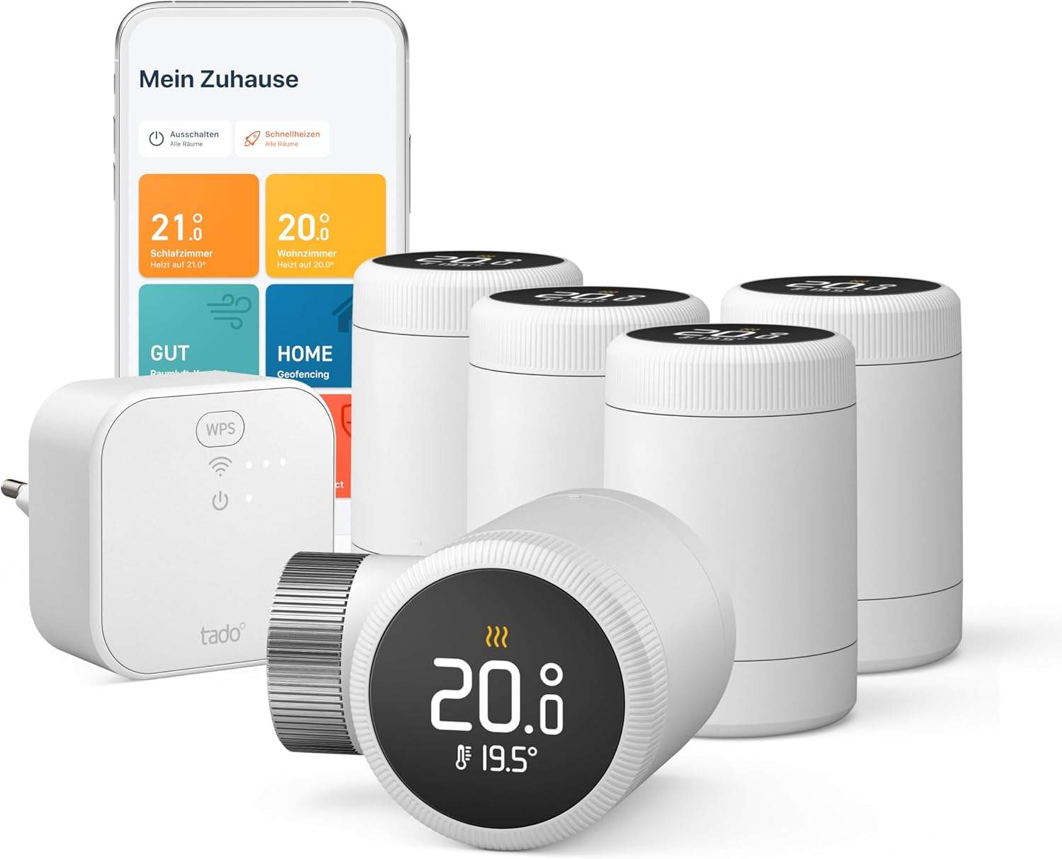
1. tado° X Heizkörperthermostat — Testsieger Matter-fähig
Das tado° X ist der beste Smart-Thermostat für Mietwohnungen 2026 . Matter-Support, ausgereifte App, Geofencing (heizt automatisch wenn du nach Hause kommst), Energie-Sparpotenzial 15-25 % vs. manuelle Heizung.
Matter 1.3-Support — funktioniert mit Alexa, Apple Home, Google Home parallel
Geofencing über App (auto-runter wenn alle weg)
Multi-Raum-Setup (max. 25 Heizkörper pro Account)
Tado° Auto-Assist abonniert: noch mehr Einsparung mit Wetter-Prognose
→ Vollständige tado° X Rezension lesen
2. tado° V3+ — Preis-Tipp tado°
Das tado° V3+ ist die günstigere tado°-Variante ohne Matter-Support . Funktioniert über die tado°-App genauso gut wie das X, nur ohne Multi-Ökosystem-Integration.
Stärken:
Gleiche tado°-App + Geofencing wie tado° X
Energie-Sparpotenzial 15-20 %
Niedrigerer Preis (79 € statt 99 €)
Einschränkungen: kein Matter, nur Alexa und Google Home (nicht Apple Home).
→ Vollständige tado° V3+ Rezension lesen
3-5. FRITZ, Eqiva, Homematic IP — die anderen Top-Picks
AVM FRITZ!DECT 302: Wer eine FRITZ!Box hat, braucht keinen zusätzlichen Bridge. DECT-Funk integriert in den Router. FRITZ!DECT 302 Rezension .
Eqiva Bluetooth Smart: Budget-Einstieg für 39 €. Bluetooth statt WLAN — App-Steuerung nur in Bluetooth-Reichweite. Kein Geofencing. Für 1-Raum-Setups OK. Eqiva Rezension .
Homematic IP Compact Plus: Bosch-Smart-Home-Pick, hochwertige Verarbeitung, sehr stabile Verbindung. Braucht aber zusätzlichen Bosch-Hub (ca. 100 € extra). Homematic IP Rezension .
Worauf du beim Kauf achten solltest
M30×1,5 Adapter ist Standard. Alle 5 Test-Modelle haben den Standard-Anschluss für deutsche Heizkörperthermostate. Vor Kauf prüfen ob deine Heizung diesen Standard hat (95 % aller deutschen Heizungen ja).
Bridge oder ohne? tado° X und V3+ brauchen die tado°-Bridge (im Starter-Set enthalten). Eqiva braucht nur Bluetooth. FRITZ braucht eine FRITZ!Box. Homematic IP braucht den Bosch-Hub.
Multi-Raum-Fähigkeit. Bei mehreren Heizkörpern lohnt sich Multi-Raum-Setup mit Zeit-Plänen. tado° und Homematic IP sind hier vorn.
Geofencing. Das beste Energie-Spar-Feature: das Thermostat senkt Temperatur wenn alle weg sind. tado° hat das ausgereiftest. Eqiva nicht.
Mehr Hintergrund: Smart-Thermostat in der Mietwohnung und Alle Smart-Thermostate .
Häufige Fragen
Darf ich als Mieter Smart-Thermostate installieren? Ja, ohne Vermieter-Erlaubnis. Du wechselst nur die obere Thermostat-Kappe (M30×1,5 Anschluss) — kein Eingriff in die Heizungsanlage. Beim Auszug nimmst du die smarten Thermostate mit, alte schraubst du wieder rauf.
Welches Smart-Thermostat ist am besten für Mieter? Das tado° X Heizkörperthermostat für 99 € — Matter-fähig, ausgereifte App, gute Energie-Einsparung. Budget-Wahl: Eqiva Bluetooth für 39 €.
Wie viel Strom spart ein Smart-Thermostat? Bei korrekter Einrichtung 15-25 % der Heizkosten. Voraussetzung: Geofencing aktiviert, Zeitpläne pro Raum, nicht ständig manuell überschrieben. Erfahrung 4-6 Wochen Eingewöhnung bis volle Einsparung.
Brauche ich für jeden Raum ein Smart-Thermostat? Idealerweise ja — sonst funktioniert das Multi-Raum-Setup nicht. Tado° und Homematic IP erlauben Mischbetrieb (z.B. nur Wohnzimmer + Schlafzimmer smart, Bad bleibt manuell).
Funktionieren Smart-Thermostate mit alten Heizungen? Ja, in 95 % aller deutschen Wohnungen. Vor Kauf prüfen: hat dein Thermostat einen M30×1,5 Anschluss? Wenn ja → kompatibel. Wenn anders → entsprechenden Adapter dazu kaufen (1-2 €).
Was passiert wenn das WLAN ausfällt? Die Thermostate behalten die letzte Programmierung lokal — Heizung läuft weiter nach Plan. Nur die App-Steuerung von außerhalb funktioniert ohne Internet nicht.
Fazit
Für die meisten Mieter ist das tado° X Heizkörperthermostat die richtige Wahl — Matter-Support, beste App, 15-25 % Energie-Einsparung. Preis-Sieger: tado° V3+ . FRITZ!Box-Nutzer: AVM FRITZ!DECT 302 . Budget-Einstieg: Eqiva Bluetooth .
Vermeide: Smart-Thermostate ohne Geofencing (das ist das beste Energie-Spar-Feature), Modelle ohne Multi-Raum-Möglichkeit (du wirst später aufrüsten wollen), oder Geräte mit proprietärer Cloud-Bindung ohne Matter.
Um dir ein optimales Erlebnis zu bieten, verwenden wir Technologien wie Cookies, um Geräteinformationen zu speichern und/oder darauf zuzugreifen. Wenn du diesen Technologien zustimmst, können wir Daten wie das Surfverhalten oder eindeutige IDs auf dieser Website verarbeiten. Wenn du deine Einwillligung nicht erteilst oder zurückziehst, können bestimmte Merkmale und Funktionen beeinträchtigt werden.
Die technische Speicherung oder der Zugang ist unbedingt erforderlich für den rechtmäßigen Zweck, die Nutzung eines bestimmten Dienstes zu ermöglichen, der vom Teilnehmer oder Nutzer ausdrücklich gewünscht wird, oder für den alleinigen Zweck, die Übertragung einer Nachricht über ein elektronisches Kommunikationsnetz durchzuführen.
Die technische Speicherung oder der Zugriff ist für den rechtmäßigen Zweck der Speicherung von Präferenzen erforderlich, die nicht vom Abonnenten oder Benutzer angefordert wurden.
Die technische Speicherung oder der Zugriff, der ausschließlich zu statistischen Zwecken erfolgt.
Die technische Speicherung oder der Zugriff, der ausschließlich zu anonymen statistischen Zwecken verwendet wird. Ohne eine Vorladung, die freiwillige Zustimmung deines Internetdienstanbieters oder zusätzliche Aufzeichnungen von Dritten können die zu diesem Zweck gespeicherten oder abgerufenen Informationen allein in der Regel nicht dazu verwendet werden, dich zu identifizieren.
Die technische Speicherung oder der Zugriff ist erforderlich, um Nutzerprofile zu erstellen, um Werbung zu versenden oder um den Nutzer auf einer Website oder über mehrere Websites hinweg zu ähnlichen Marketingzwecken zu verfolgen.
Einwilligung verwalten